

Problem & Hypotheses
THE PROBLEM:
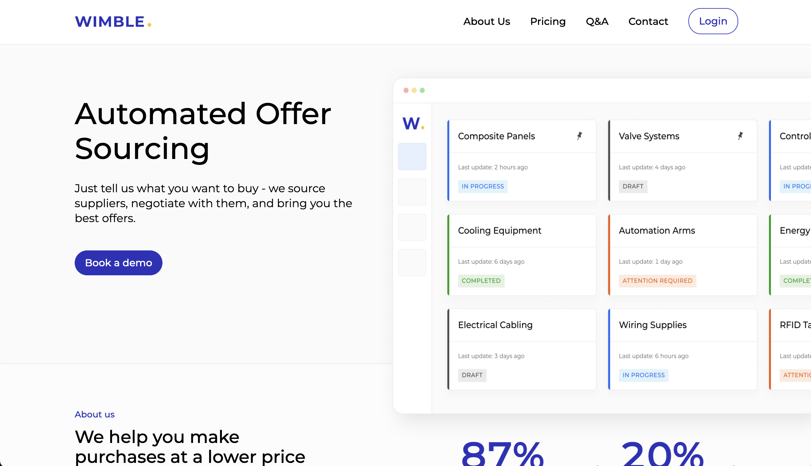
Who are Wimble.AI and what is the problem they need to solve?
Wimble.ai was concieved as an AI powered procurement service for businesses looking to automate their purchasing process and do so at a lower price and with zero time investment. Having discussed the app and business model with the CEO, it was decided that i would be brought onboard to create a low fidelity wireframe and mock up of the app for the purposes of securing potential investment capital. I was supplied with the User Flow and from there was able to begin the process of conceptualising the process on a more granular level.
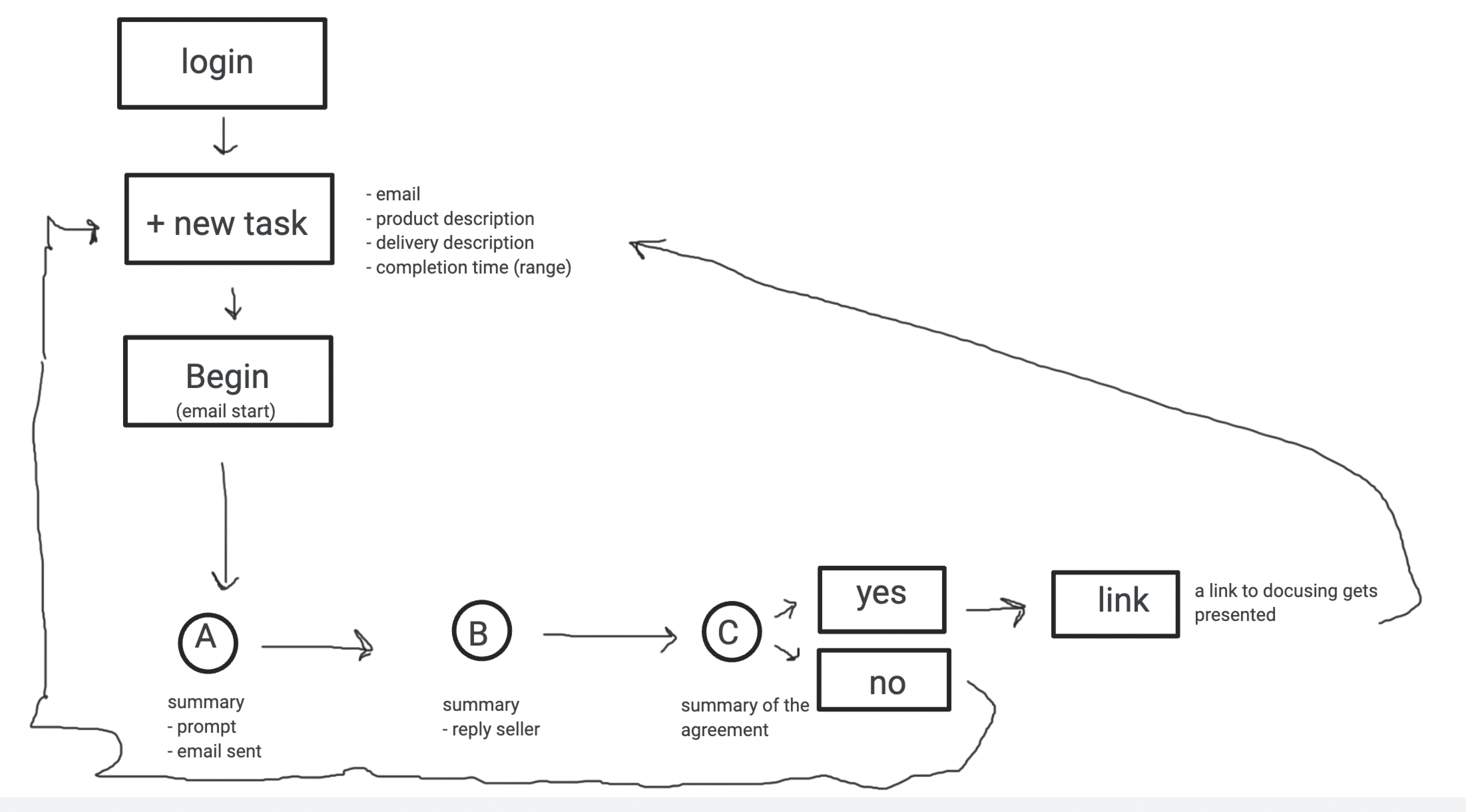
Original User Flow Supplied by Client.
Step #1 (Benchmarking)
Finding similar products
With new products being designed from scratch, i find the best way to begin to conceptualize the product and flow is to first conduct a round of Benchmarking. In this case i was interested in how SAAS providers display their user interfaces and also how the varying process on offer are laid out. I was particularly drawn to automated marketing service providers like Mailchimp and liked their interfaces. I wanted to create a similar product that was intuitive while offering the user an array of options and actions without being overwhelming.
I also found many Service providers using a side menue that featured navigational componenets as well as user options. This side menu tends to remain stationary and constant while the main section of a page will be more transient and changing depending on the users inputs. I was interested in employing such a device for the sake of function and convenience.
User Testing Phase
USER INTERVIEWS
We conducted multiple user interviews Via Zoom, following an interview script. Each candidate was carefully screened with those not falling within the clients targeted user profile being removed from the approved group.
each interview was conducted in line with our script with interviewees being encouraged to openly share their thoughts in real time.
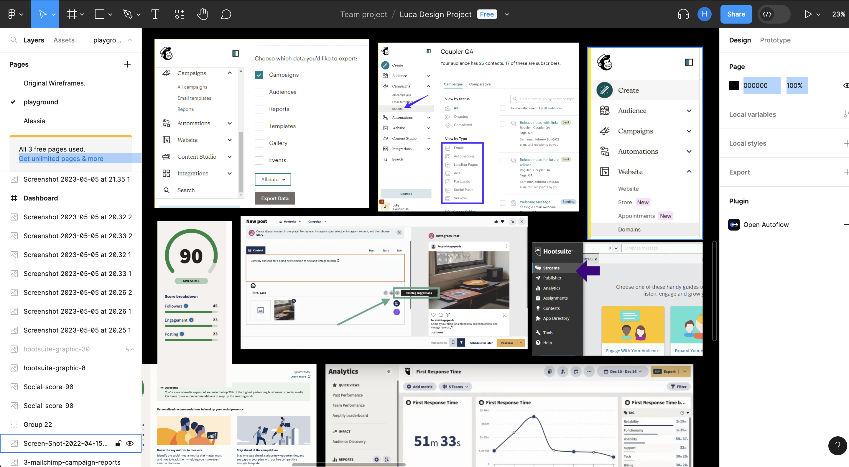
Benchmarking Session Screenshot.
Benchmark Notes/Takeaways
- Conducted user Benchmarking focusing primarily on SAAS Products.
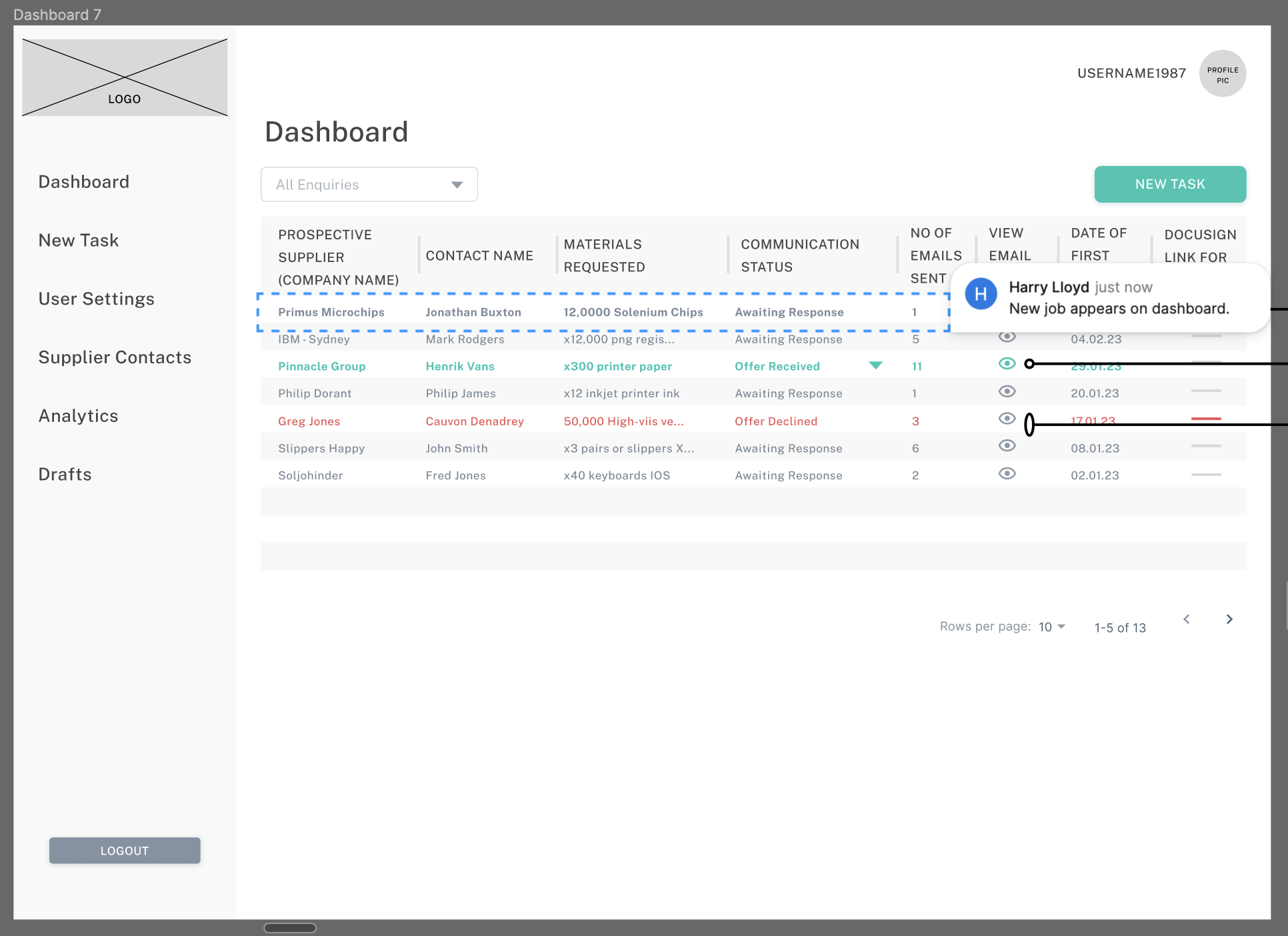
- Users were normally sent to a dashboard with an array of potential tasks laid out.
- Users could view current or ongoing tasks from the dashboard.
- Potential Categories conceptualised from Benchmarking:
- Dashboard
- Create New
- Supplier Contacts
- Analysis
- User Options
- Deciding Factors of Procurement (material, cost, timeframe etc)
- Ongoing Tasks / Current Live Tasks
User Findings
- Conducted user research/testing with 9 users who fit the profile.
- Users were given an array of tasks.
- Users were encouraged to verbalise their experiences throughout the process.
- Insights were categorized into the following:
- Usability
- Negatives
- Visuals/Aesthetics
- Content
- Formatting
- Deciding Factors of Travel
- Booking Process
Draft Layout #1 (Derived from notes taken from benchmarking)
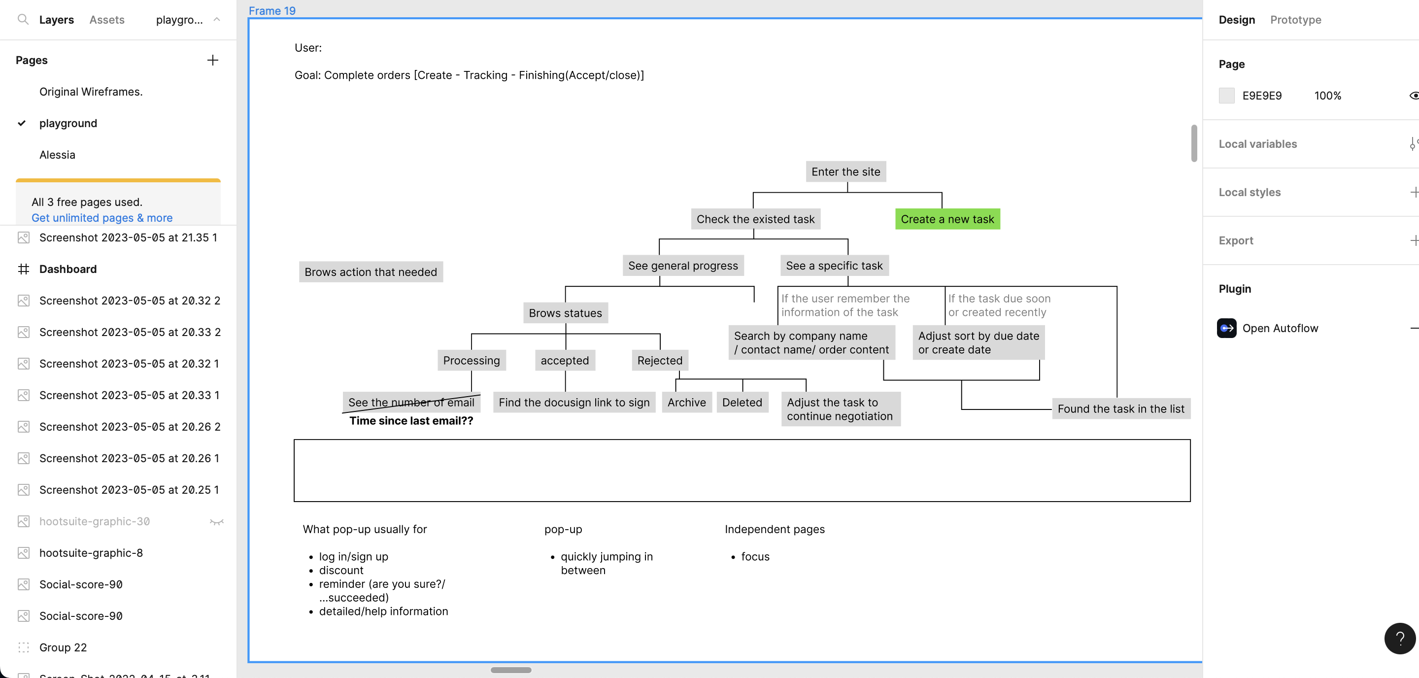
User Flows
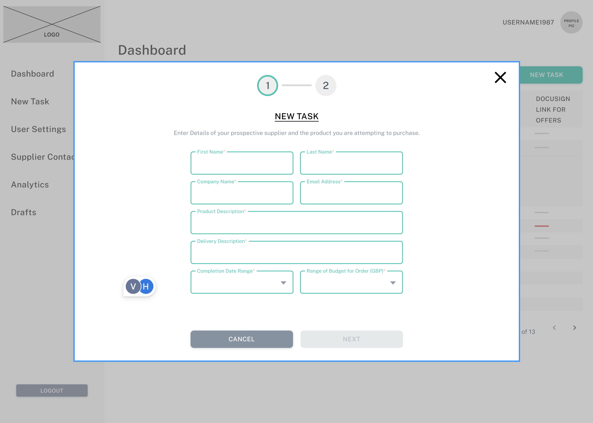
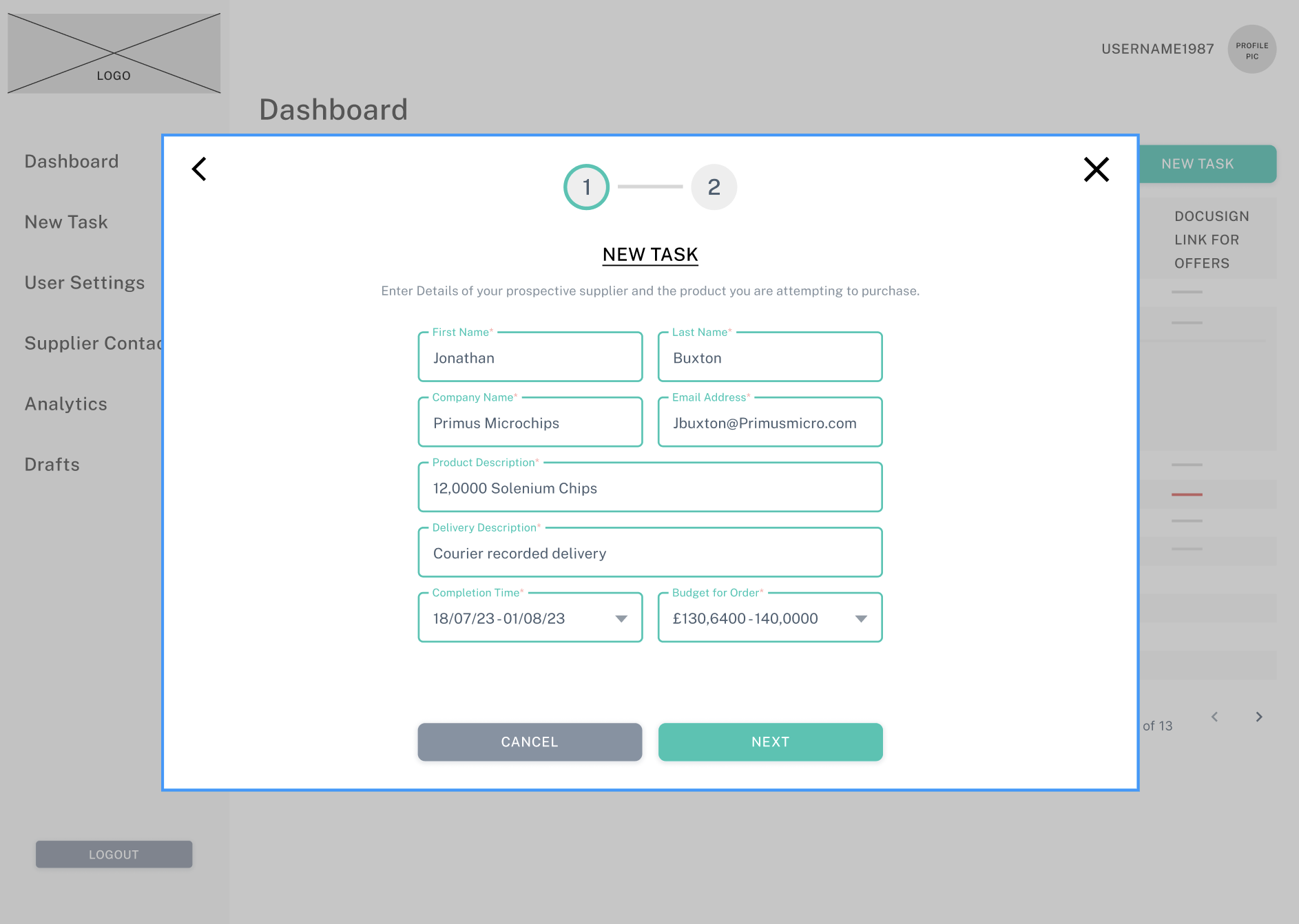
Once i had decided on the elements that i wanted to include in the product, I wanted to better understand how the user would interact with the A.I. and how many touchpoints or points of input would be required for the process to reach a conclusion. After consultation with the CEO and Dev Team I was able to better understand how the System would interface with the A.I Provider and the preferred path of a user. Once i had understood these elements i created a basic user flow for a happy path in which a user enters the details for an item they are looking to procure for their business, the preferred cost, the company email address that they want the Software to liase with and a timeframe (if required).
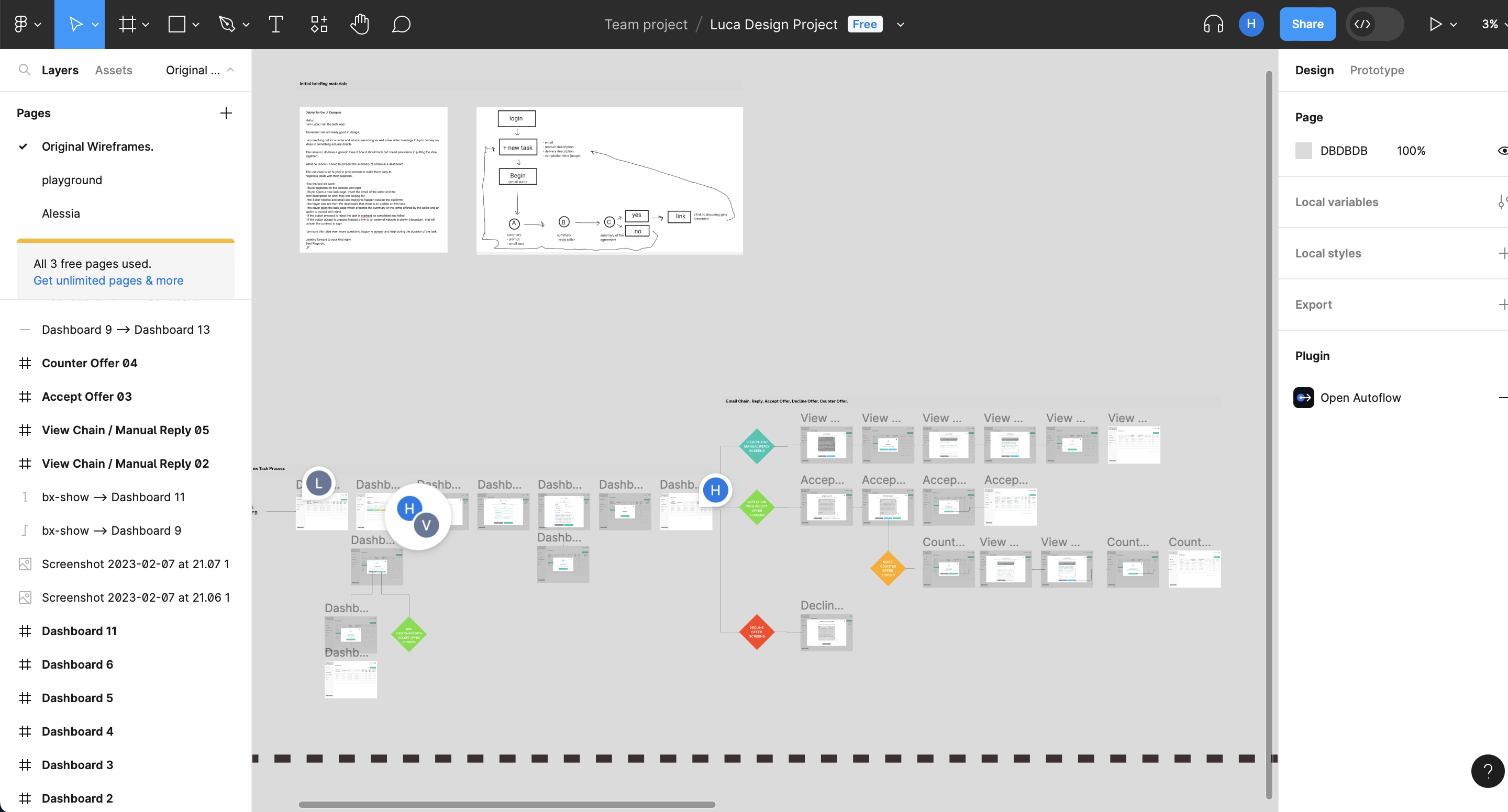
Lo-Fi to Mid-Fi Prototyping
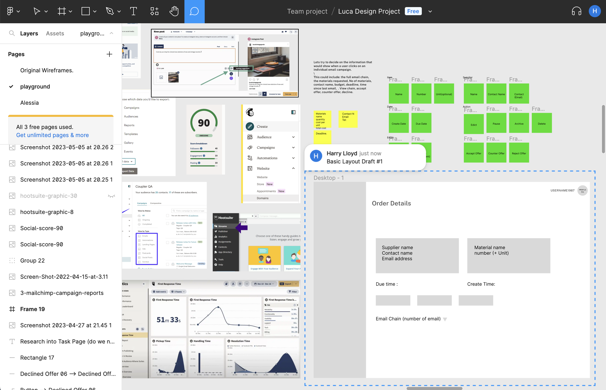
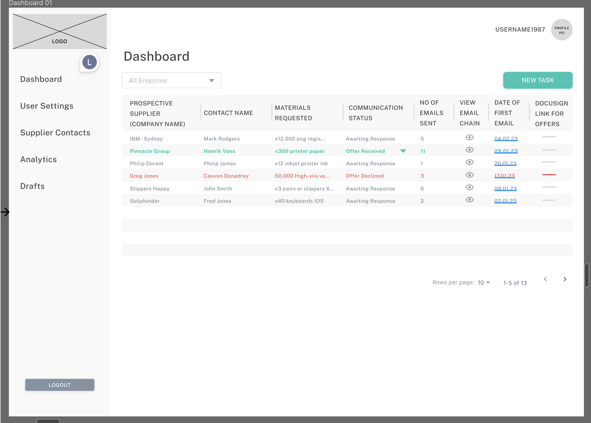
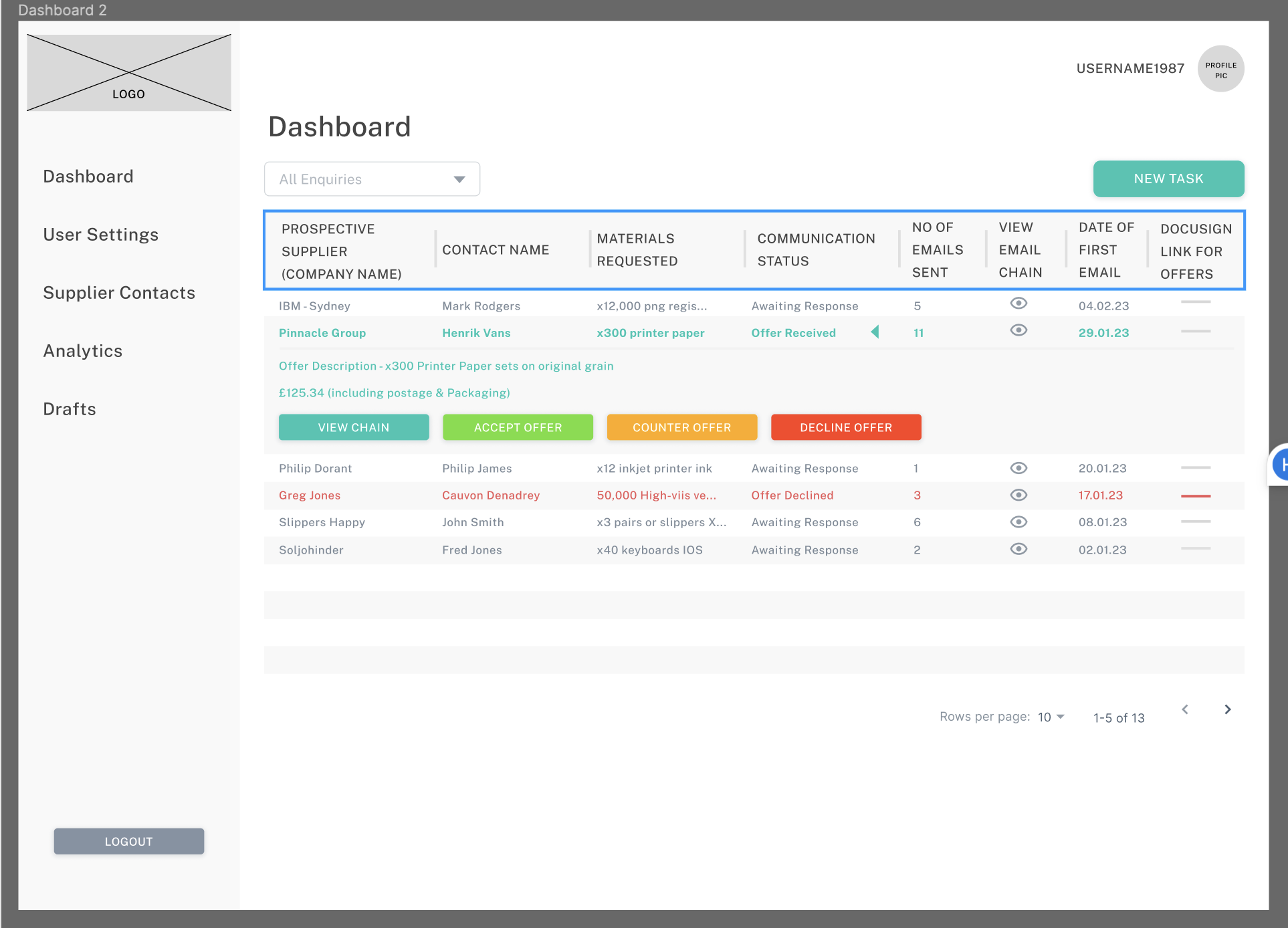
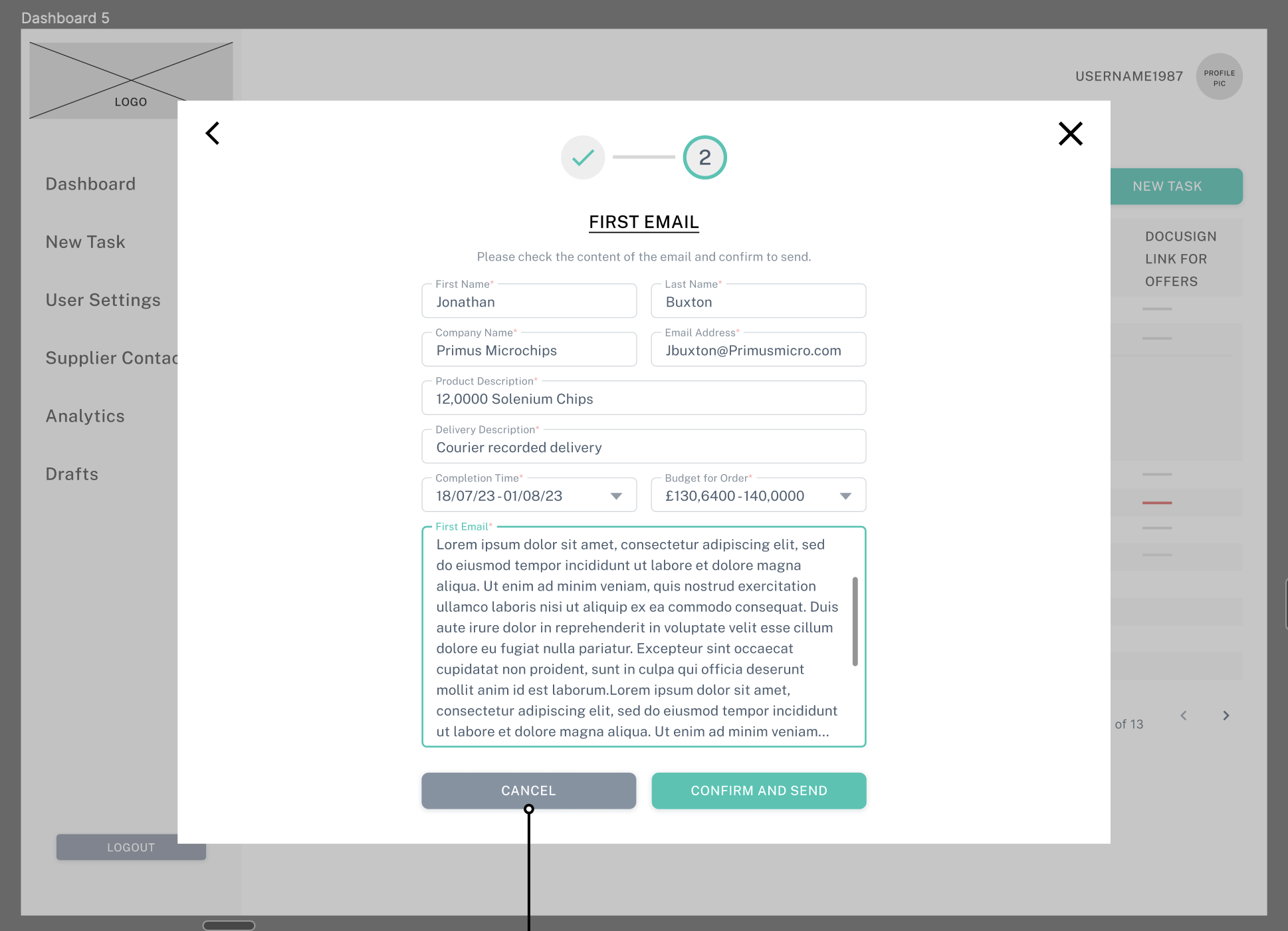
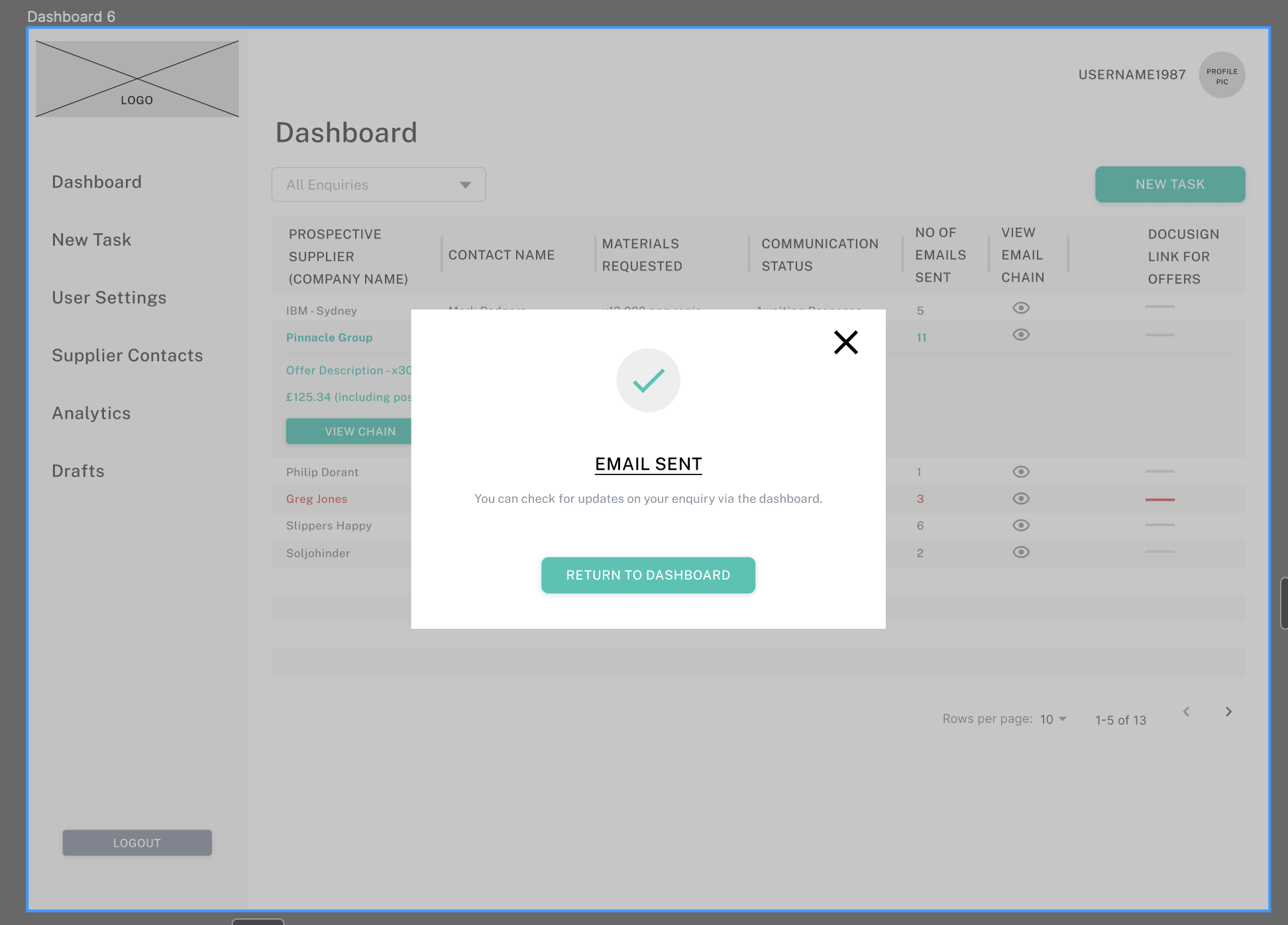
To begin the design process, wireframing and low fidelity prototypes were required. The idea at this stage, was to delve deeper into each journey flow and to firstly create a happy path for the user. As this was an A.I product i wanted to diferentiate between sections of user input and automated processes and felt the best way to do this would be to create a different section with a different visual identity for the A.I input sections, this resulted in the creation of the New Task Popup screens (see below) which stand separately from the dashboard and act as a differentiator.
Presentation of Flows
Following on from the Wireframing phase, i arranged a presentation for the client to view the prototype. This was to show a complete journey where the user inputs their procurement requirements, completes a new task flow, returns to the dashboard and finds an offer from the contact awaiting an approval, accepts this offer and sends a Docusign document to confirm the purchase.
I wanted to show the journey right up until the point where a purchase has been confirmed (pending signature of documentation). I was also able to include some edge cases such as offer rejections and cases in which a user may need to amend an order. The Figma File is available for viewing below.
TEAM: Freelance
PROJECT: Wimble A.I UX/UI Design
ROLE: UX / Product Design Lead
TIMELINE: 3 Months
WEBSITE: Wimble.ai
Selected Works

Wimble.AI [SAAS Product, A.I]Web Application

MyHomeTV App [Freelance]App Design

Entain [Core UX/UI Design][Core UX/UI Design]

PartyPoker Tutorial [Player Education]Web Application

Crypto Payments [Entain]Corporate Design
Ladbrokes Registration [Entain]Corporate Design / Findings Presentation

Startup Sherpa Website [Freelance]Corporate Design
Mintage Payroll [SAAS Product, HR]Web Application

Linger website [Freelance]Corporate Design

Dudley House WebsiteCorporate Design

LU2ON WebsiteCorporate Design
British Pearl [Concept Design]App Design
Amazon Alexa - Australia TeamAudio-linguistic UX Design
Print ProductionCorporate Design