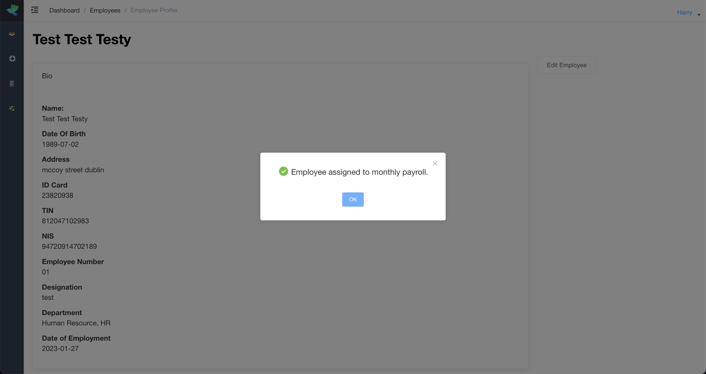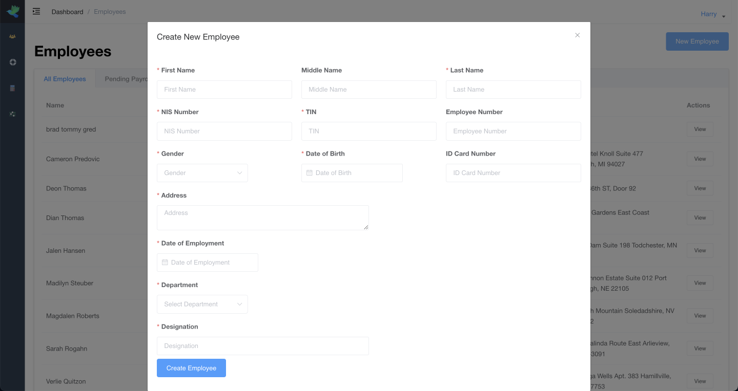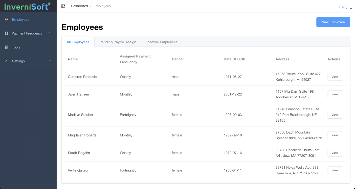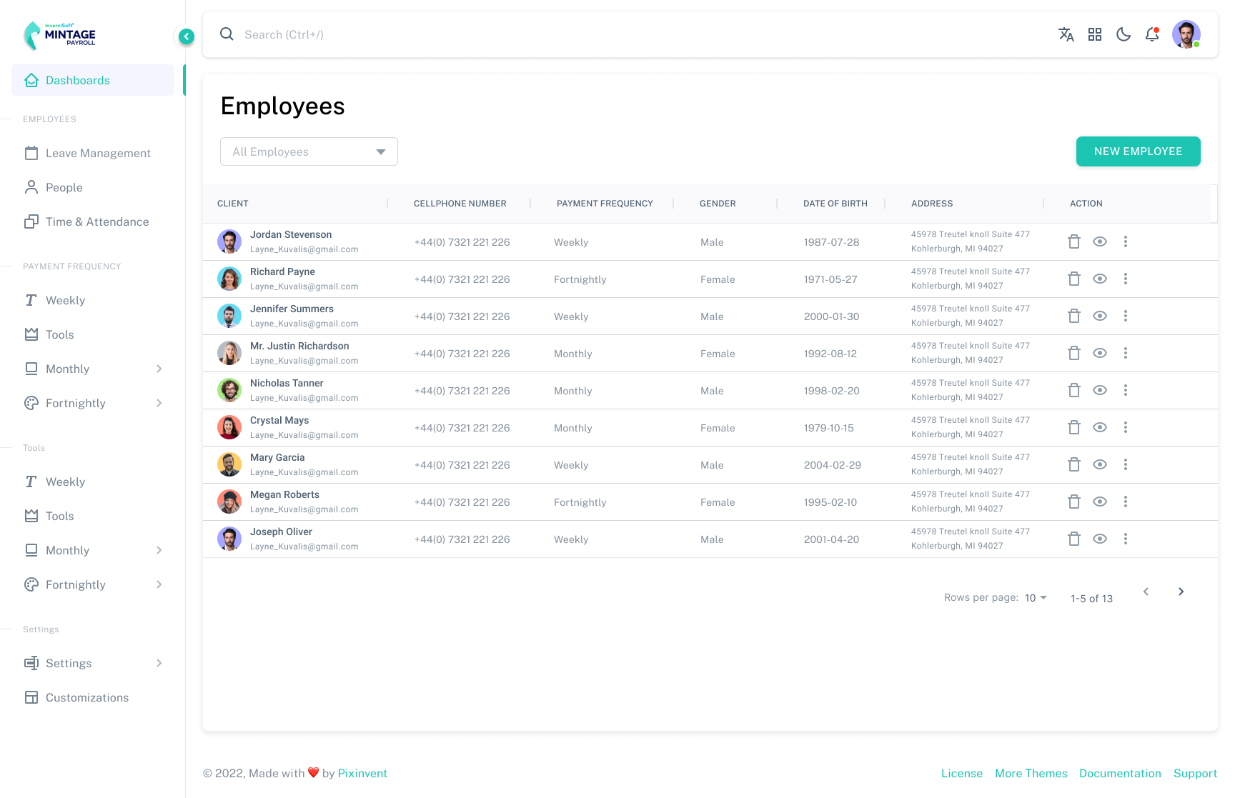
Case Study: Mintage Payroll
THE PROBLEM:
Designing a Comprehensive Payroll System
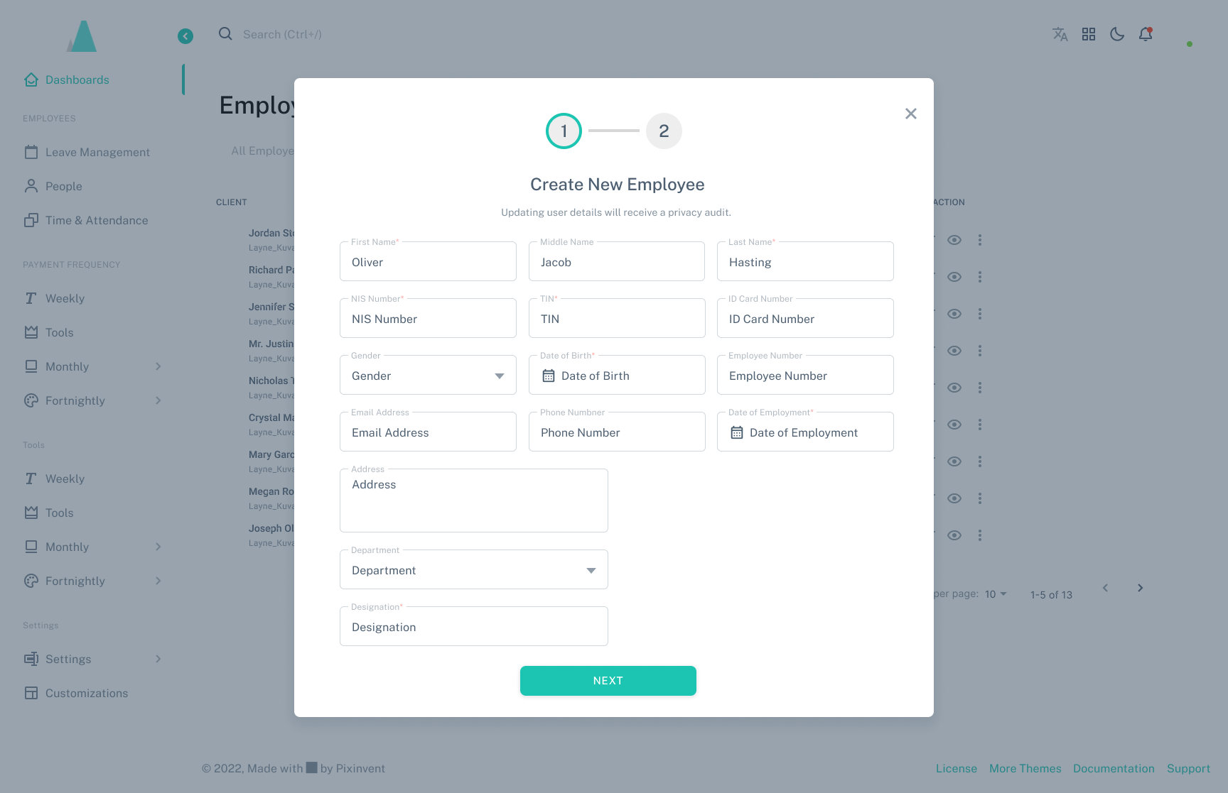
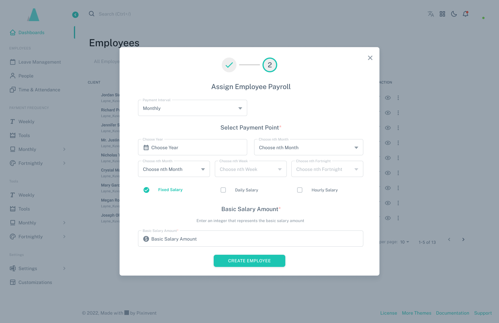
Mintage Payroll, a payroll management SaaS platform, sought to streamline payroll processing for businesses by offering a user-friendly, fully automated system. As a freelance designer, I was tasked with creating the system’s user interface from scratch, ensuring it catered to complex payroll needs while remaining accessible to users of varying technical proficiency.
THE TASK:
Broken Down Into Objectives
- Design an intuitive payroll management system with tools for employee record management, payment processing, tax calculation, and compliance tracking.
- Develop a dashboard and workflows that balanced simplicity with powerful features for HR professionals and payroll managers.
- Deliver a prototype that could support client presentations and accelerate development timelines.
User Testing Phase
USER INTERVIEWS
We conducted multiple user interviews Via Zoom, following an interview script. Each candidate was carefully screened with those not falling within the clients targeted user profile being removed from the approved group.
each interview was conducted in line with our script with interviewees being encouraged to openly share their thoughts in real time.
Benchmarking Session Screenshot.
Research
Benchmarking and Industry Research:
Conducted competitive analysis of payroll SaaS platforms, such as Gusto and ADP, identifying strengths like streamlined dashboards and common pain points like over-complicated settings.
Compiled insights into design principles focused on clarity, compliance tracking, and action-oriented dashboards.
Prioritized features:Dashboard Overview for real-time payroll metrics.
Employee Directory for comprehensive records.
Pay Cycle Management for seamless scheduling and automation.
Compliance Alerts to flag tax or legal issues.
User Findings
- Conducted user research/testing with 9 users who fit the profile.
- Users were given an array of tasks.
- Users were encouraged to verbalise their experiences throughout the process.
- Insights were categorized into the following:
- Usability
- Negatives
- Visuals/Aesthetics
- Content
- Formatting
- Deciding Factors of Travel
- Booking Process
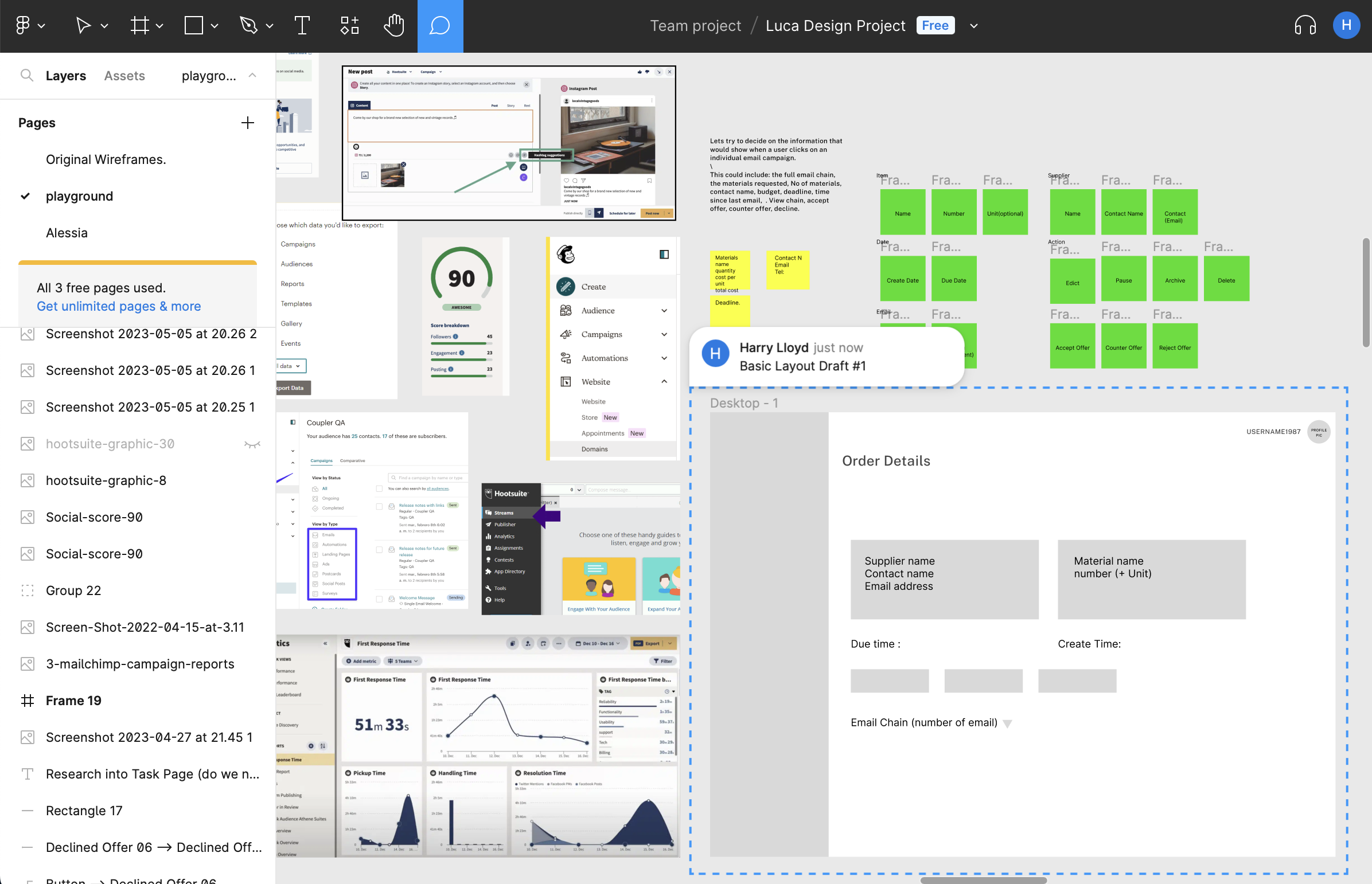
Draft Layout #1 (Derived from notes taken from benchmarking)
User Flows
To ensure a smooth user experience, I created detailed user flows for Mintage Payroll’s core interactions. Each flow was designed to minimize steps, address pain points, and align with the most commonly required functions. The key processes, included payroll cycle initiation, employee data updates, and tax submission.
In addition I created a “happy path” where users could process payroll in three streamlined steps: upload employee data, review calculated payouts, and finalize payments. (all flows detailed below)
Payroll Processing Flow
Start Point: Users log into the dashboard and access the “Run Payroll” feature.
Key Steps:Upload employee data (via CSV or manual entry).
Review automated calculations, including tax deductions and overtime.
Approve payments and initiate transfers.
End Point: The payroll is completed, and a summary is logged in the “Payment History” section.
Employee Management Flow
Start Point: Users navigate to the “Employee Directory.”
Key Steps:Add or update employee details (e.g., salary, benefits).
Assign tax profiles or adjust deductions.
End Point: Changes are saved and reflected in the next payroll cycle.
Compliance Alerts Flow
Start Point: A compliance alert is triggered on the dashboard (e.g., missing tax submission).
Key Steps:Users click the alert to review the issue.
Options are presented to correct errors, submit forms, or escalate issues.
End Point: Alerts are resolved, ensuring compliance and reducing risks.
Analytics and Reporting Flow
Start Point: Users access the “Reports” tab.
Key Steps:Generate real-time reports for payroll trends, tax submissions, and employee costs.
Export reports in preferred formats (e.g., PDF, Excel).
End Point: Insights are available for strategic decision-making.
These user flows ensured that Mintage Payroll was both intuitive for first-time users and efficient for regular tasks, enhancing the overall user experience.
Prototyping
Low to High-Fidelity Prototyping:
Designed wireframes that emphasized clarity, using data visualization and minimalistic layouts to reduce cognitive load.
Introduced a tabbed navigation system for quick access to payroll history, employee details, and compliance reports.
Iterated on feedback from stakeholders to ensure intuitive navigation and easy onboarding for first-time users.
Handoff and Results:
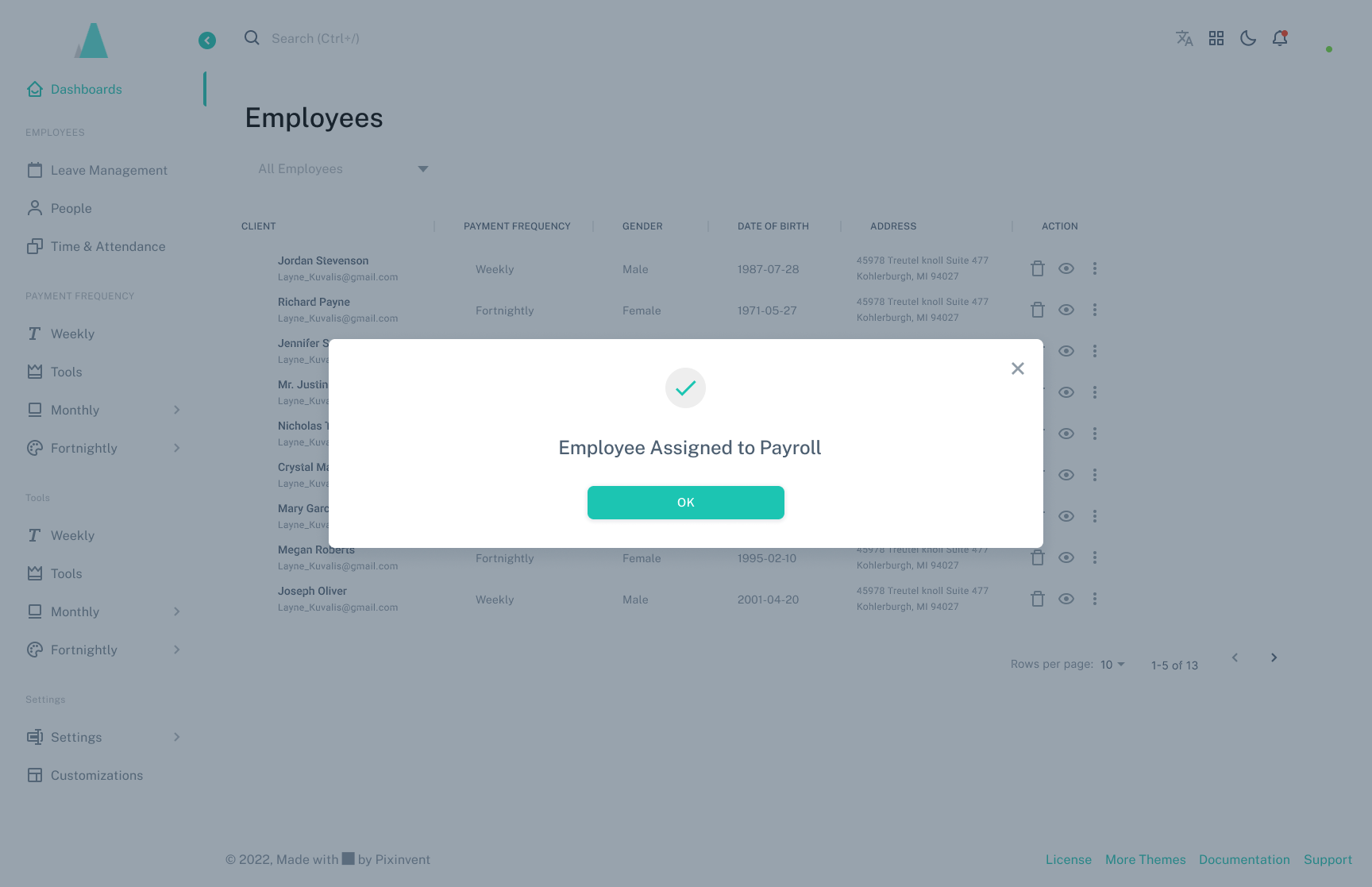
Delivered a detailed interactive prototype using Figma, showcasing end-to-end payroll processing, including tax calculations and error handling.
Presented the design to stakeholders, emphasizing how the system addressed user pain points and reduced administrative effort.
Provided a design library to ensure seamless integration with the development team’s workflow.
- Time Efficiency: Reduced the payroll processing flow from 7 steps to 3, cutting average processing time by 40%.
- Client Satisfaction: Earned a 100% approval rating during stakeholder presentations, with specific praise for the dashboard’s clarity and ease of navigation.
- Compliance Confidence: Integrated real-time compliance alerts that minimized errors, reducing late tax filings by an estimated 30%.
- Development Support: Delivered a complete design library, accelerating the development timeline by 20%.
- Business Growth: Enabled Mintage Payroll to attract three beta clients within the first month of showcasing the prototype.
Takeaway
The Mintage Payroll project highlights my ability to design intuitive SaaS solutions for complex workflows. By focusing on user needs, simplicity, and compliance, I delivered a system that transformed payroll management into an efficient, stress-free experience.
TEAM: Freelance
PROJECT: Mintage Payroll SAAS UX/UI Design
ROLE: UX / Product Design Lead
TIMELINE: 3 Months
WEBSITE: Mintage Payroll by Invernisoft
Selected Works

Wimble.AI [SAAS Product, A.I]Web Application

MyHomeTV App [Freelance]App Design

Entain [Core UX/UI Design][Core UX/UI Design]

PartyPoker Tutorial [Player Education]Web Application

Crypto Payments [Entain]Corporate Design
Ladbrokes Registration [Entain]Corporate Design / Findings Presentation

Startup Sherpa Website [Freelance]Corporate Design
Mintage Payroll [SAAS Product, HR]Web Application

Linger website [Freelance]Corporate Design
Dudley House WebsiteCorporate Design

LU2ON WebsiteCorporate Design
British Pearl [Concept Design]App Design
Amazon Alexa - Australia TeamAudio-linguistic UX Design
Print ProductionCorporate Design
