
Welcome to my Entain Core UX/UI Design page, dedicated to showcasing a series of smaller, yet impactful, UX/UI design projects for Entain Group, one of the world's leading sports betting and gaming organizations. These projects demonstrate my proficiency in creating intuitive and engaging user experiences that cater to a diverse and global audience. Each case study reflects my ability to integrate user-centered design principles with the dynamic needs of the sports betting and gaming industry, ensuring seamless interactions and enhancing overall user satisfaction. Dive in to explore the innovative solutions and design strategies that have contributed to Entain Group's digital excellence.
Story 1
Shelby Design System (All Entain Brands)
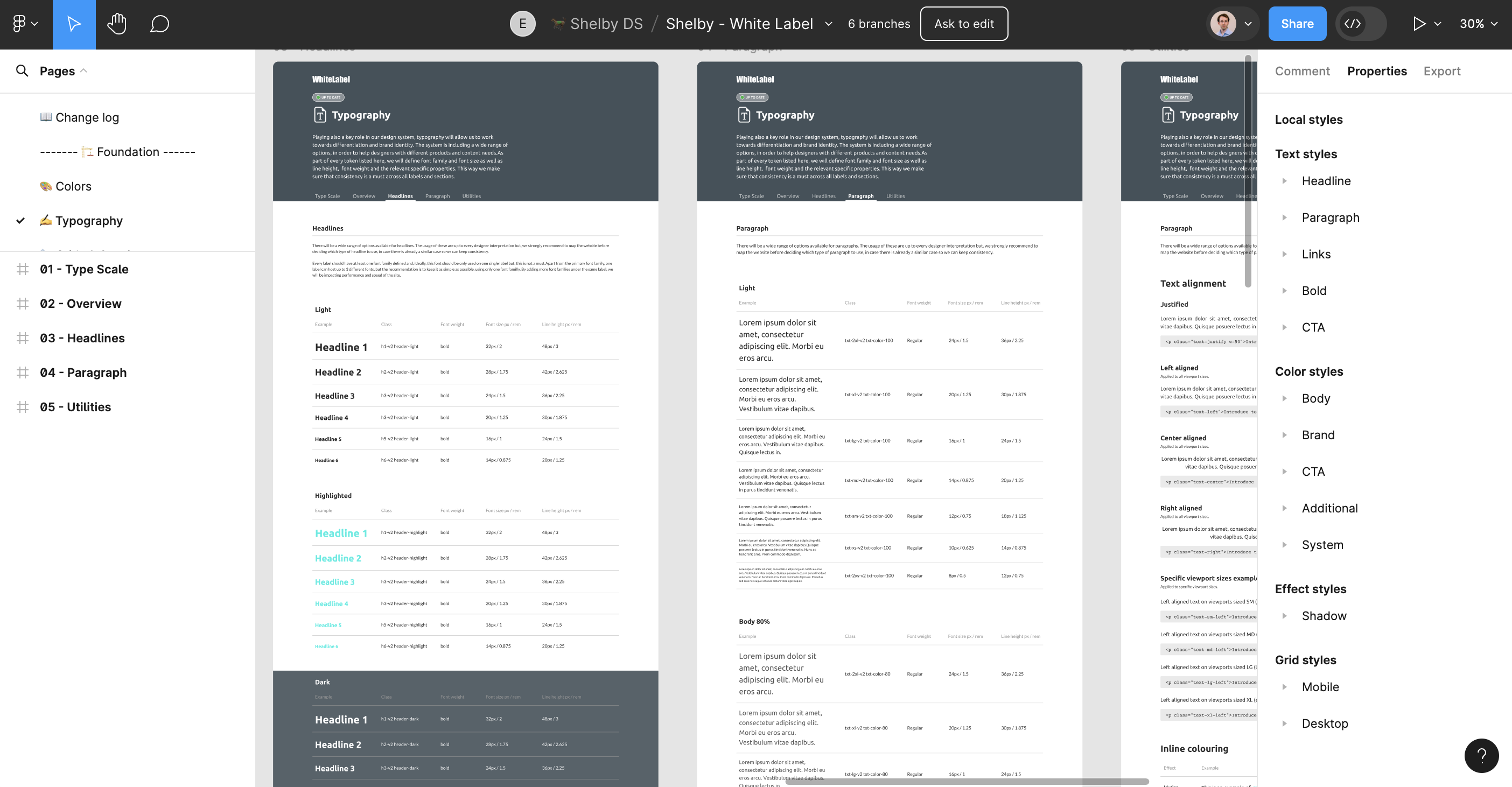
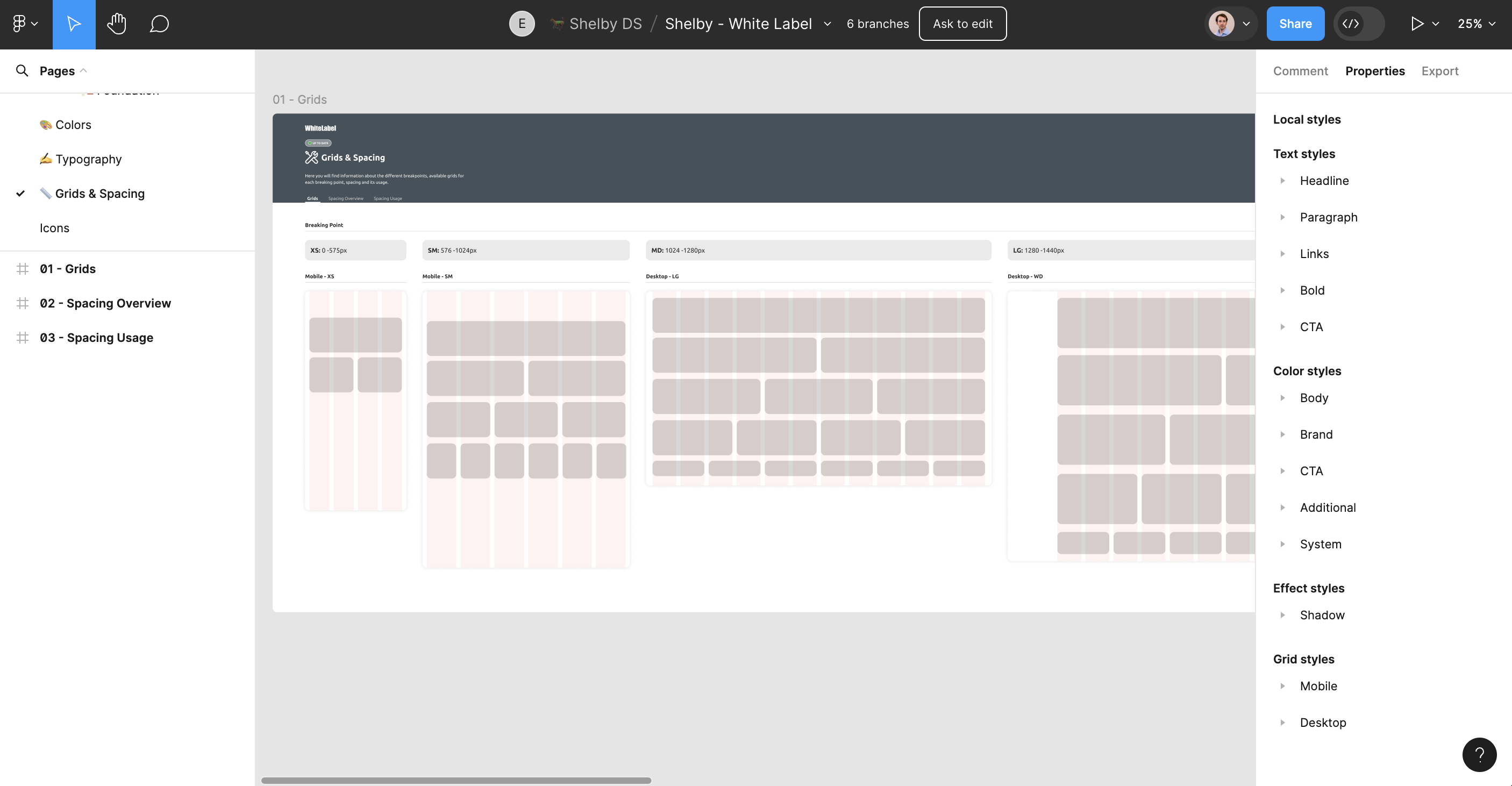
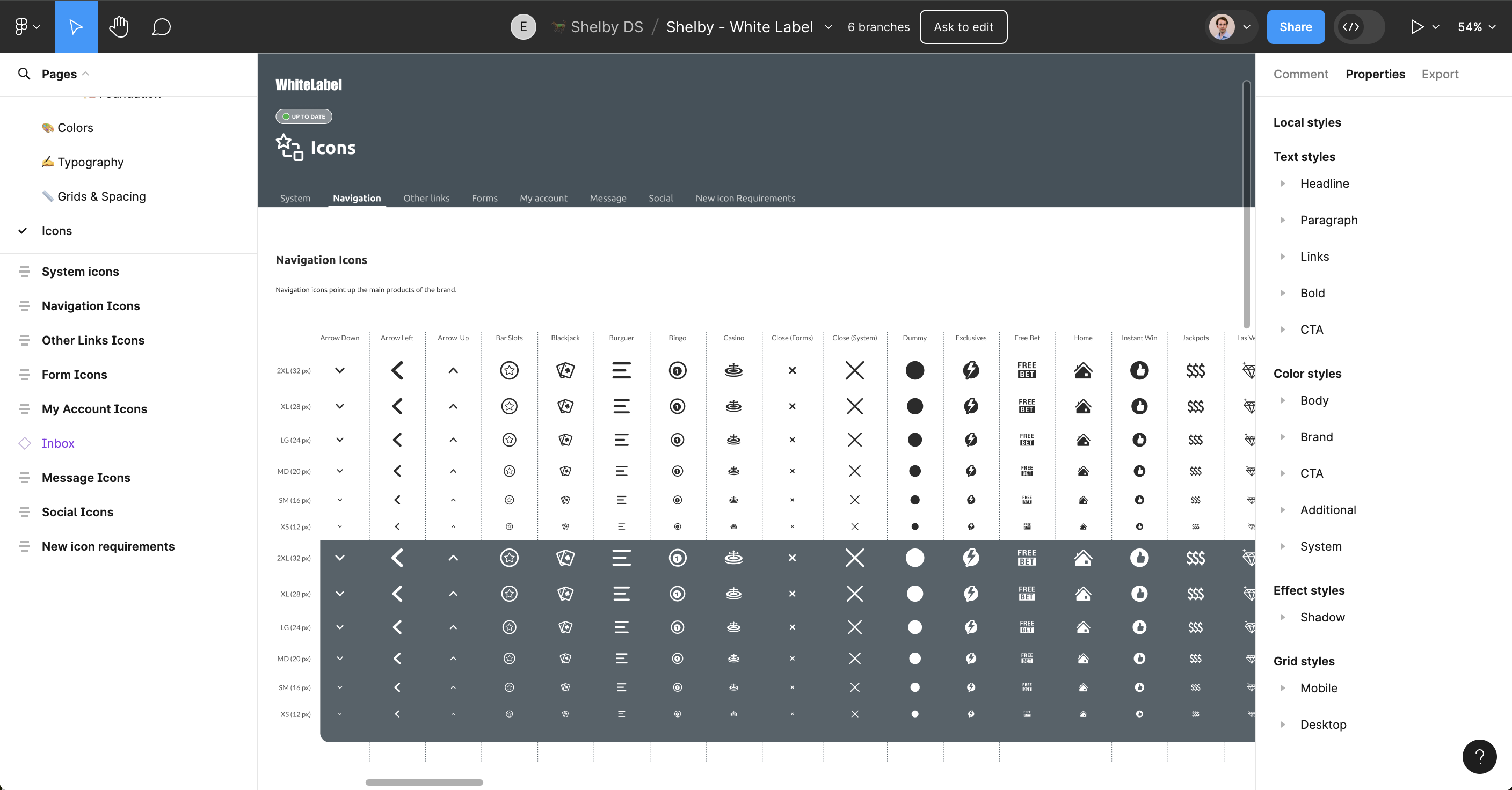
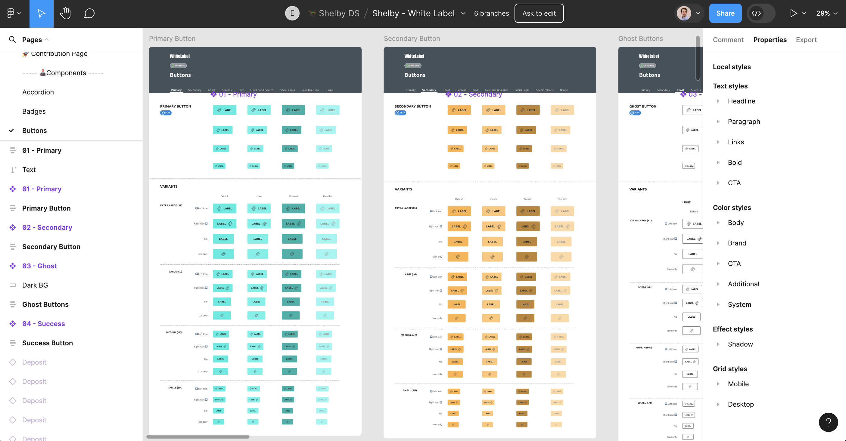
In collaboration with a talented three-person team, I played a pivotal role in the creation of the 'Shelby' design system for Entain Group, tailored specifically for the our i-gaming and online gambling UK brands such as Bwin, Ladbrokes & Coral (to name a few).
We began with comprehensive user research and stakeholder interviews to understand the diverse needs and behaviors of our audience. This informed our development of a cohesive visual language and a robust set of UI components, ensuring consistency and accessibility across platforms. We utilized atomic design principles, breaking down the interface into fundamental building blocks, which allowed for scalable and reusable components. Rigorous usability testing and iterative feedback loops were integral to our process, ensuring that every element met industry standards for both functionality and aesthetic appeal. By leveraging Figma for component design and documentation, we created a living, breathing design system that supports rapid prototyping and efficient collaboration, ultimately enhancing the user experience across Entain Group’s digital products.
Story 2
Gambling Controls & Self Exclusion Products (All Entain Brands)
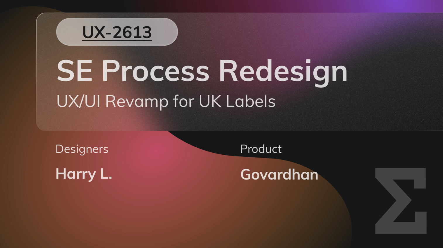
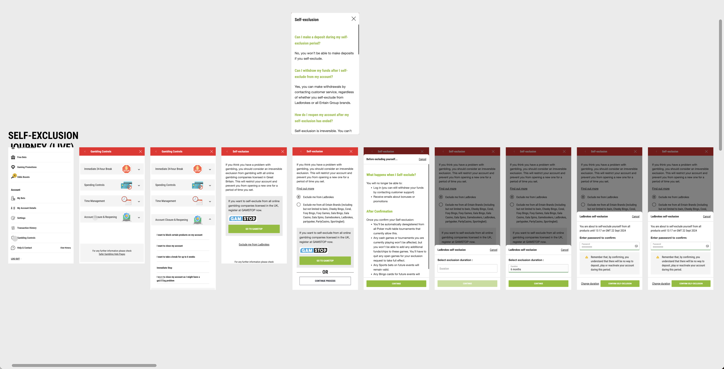
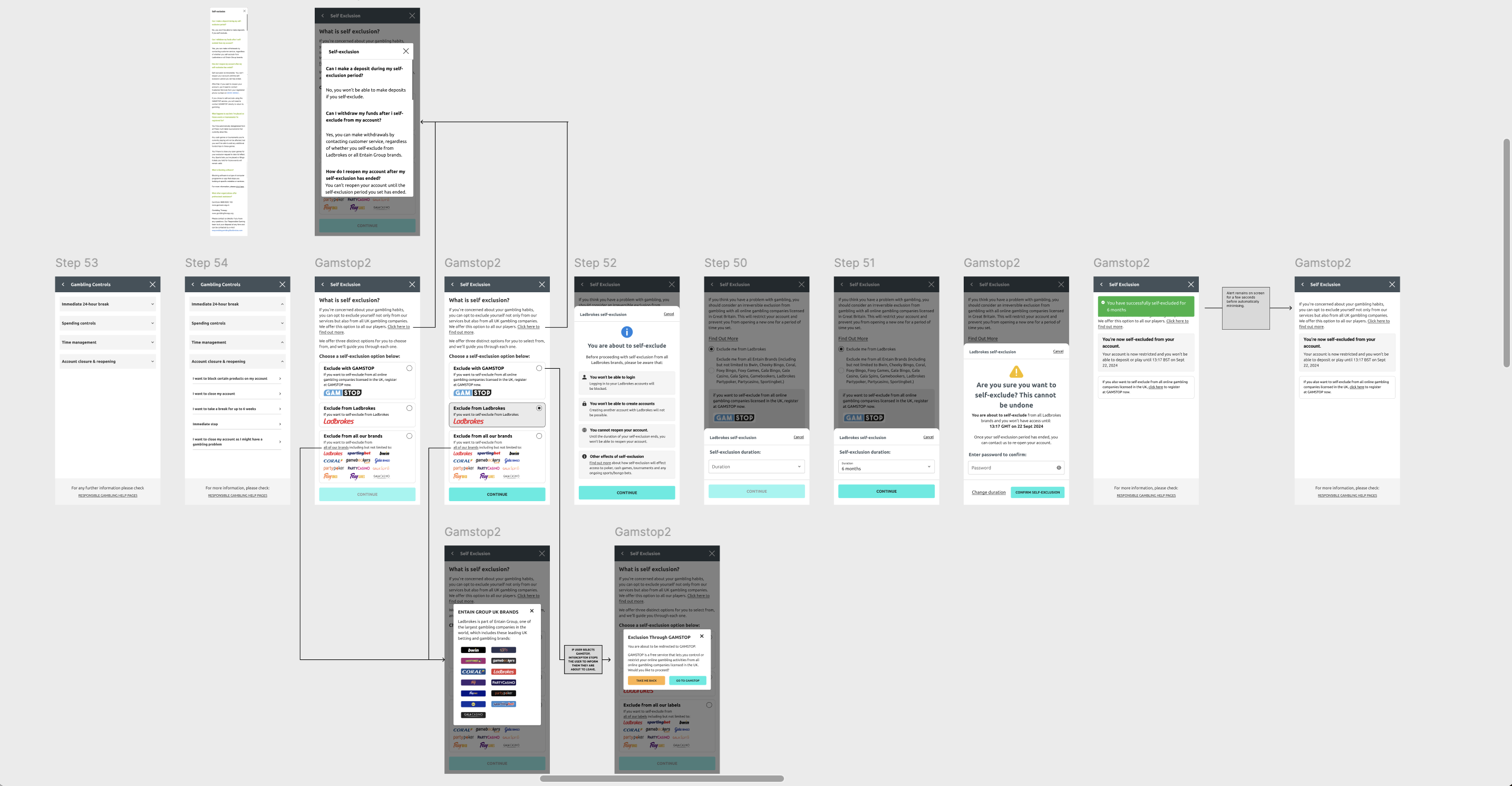
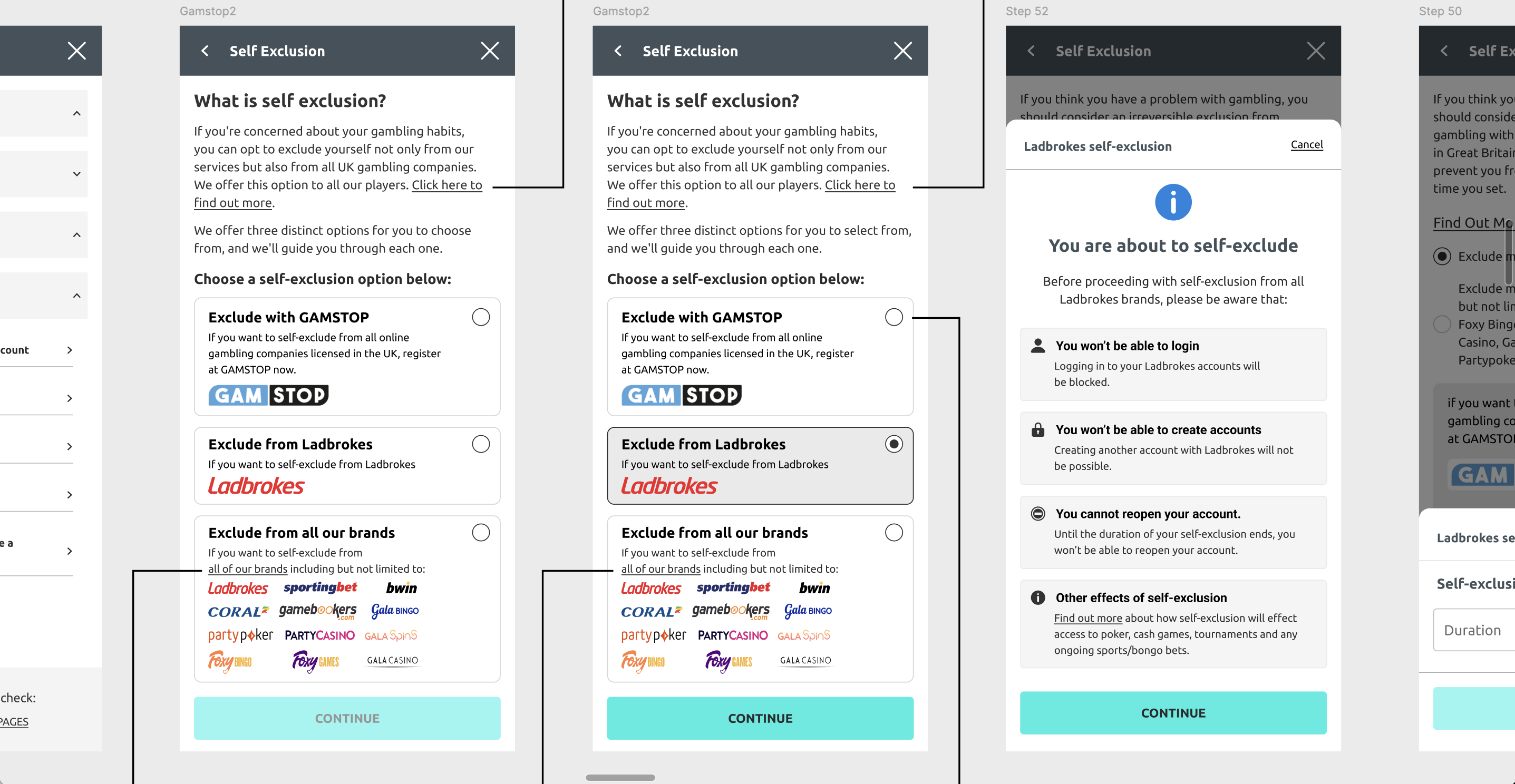
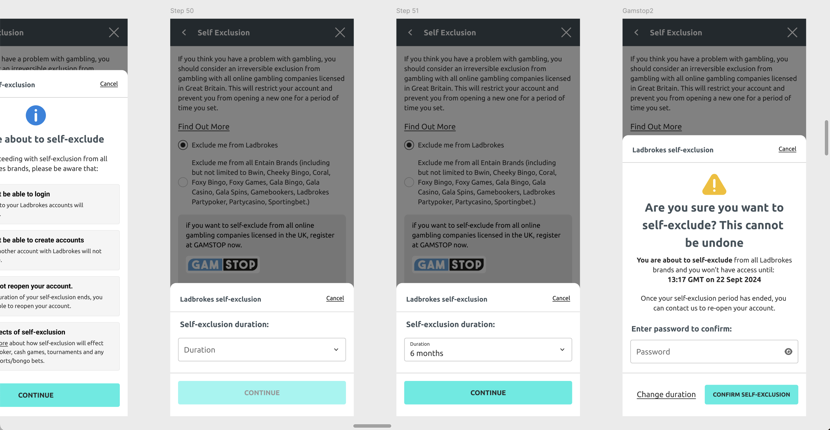
Project Overview: Redesigned the Timeout/SE journey to enhance user awareness of consequences. The previous implementation used small text formats, likely overlooked by users.
Background: 35% of Responsible Gambling (RG) related calls were about timeout and self-exclusion account reopening. Business stakeholders aimed to reduce low-risk players (spending <£50) opting for self-exclusion (38%) and timeout (20%).
Hypothesis: Users were not understanding the consequences of timeout/self-exclusion due to poor information hierarchy and UI.
Design Requirements: Redesign info/confirmation pages with effective use of colors and images to ensure users pay attention before completing the timeout/self-exclusion journey. Targeted all UK labels and impacted both mobile and desktop pages, including dark mode designs.
Result: RG-related calls regarding self-exclusion and account reopening reduced by 29%. Projected annual customer retention increased by 3.89%. Low-risk players enacting self-exclusion decreased from 38% to 12%.
Story 3
Player Education Hub (Party Poker)
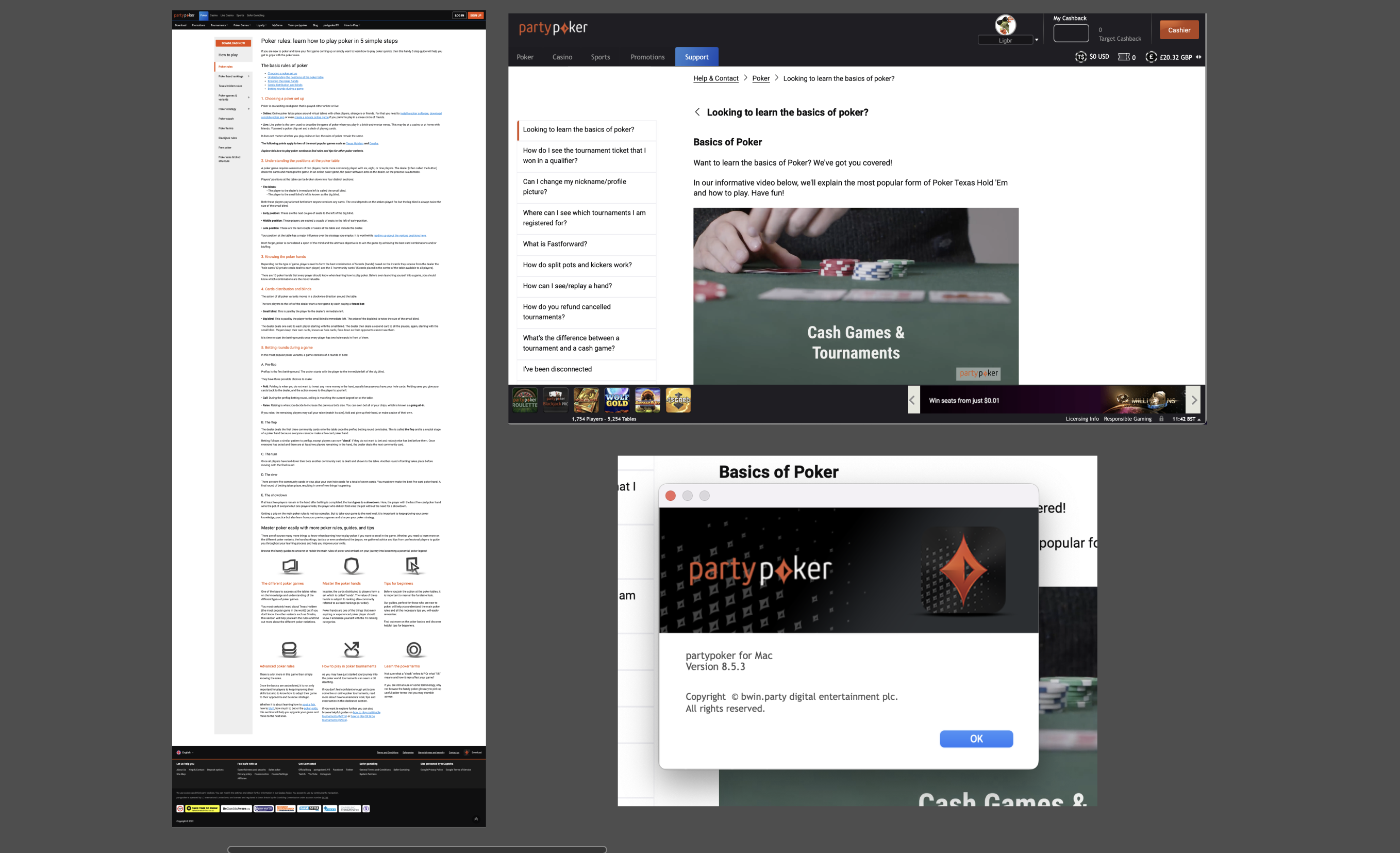
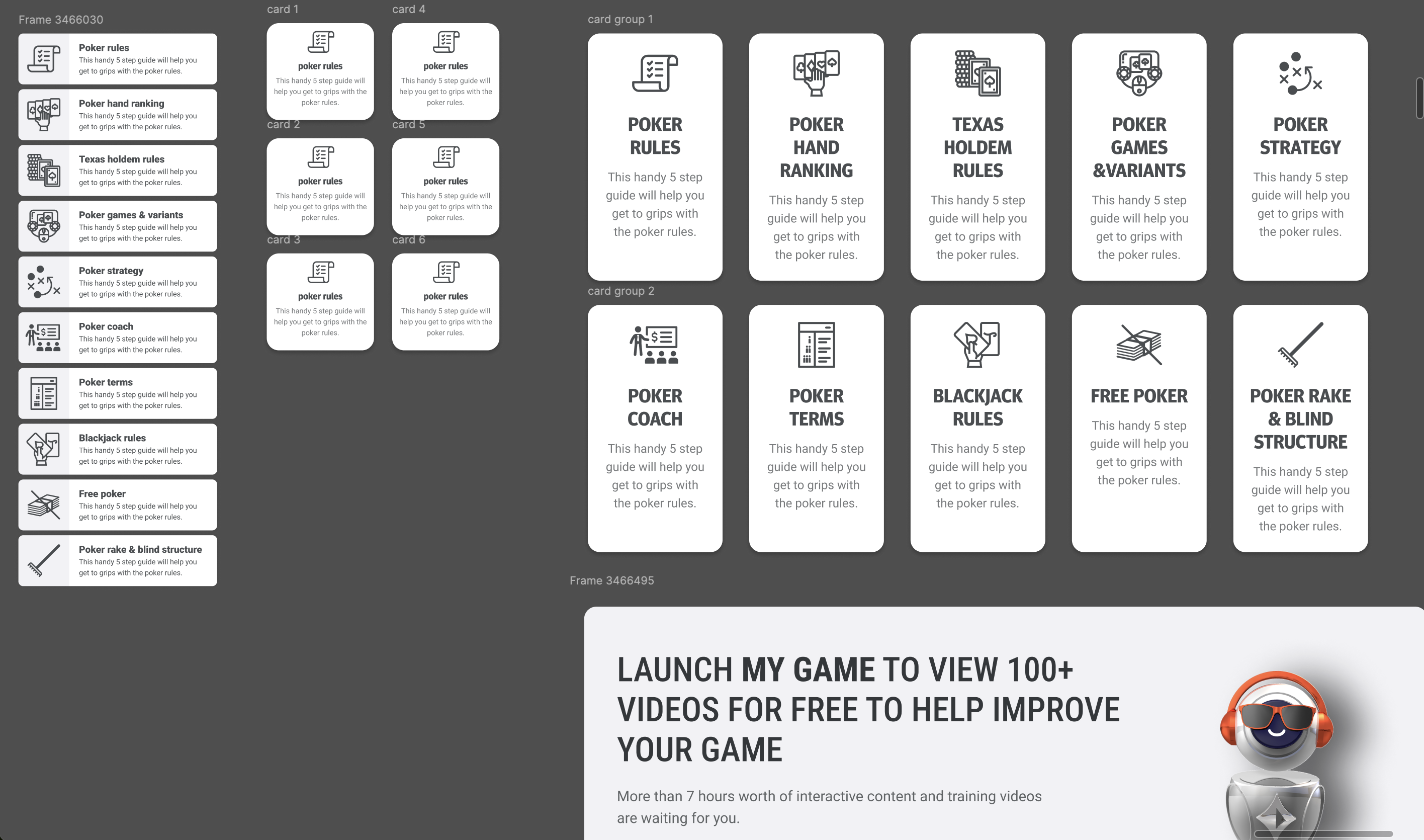
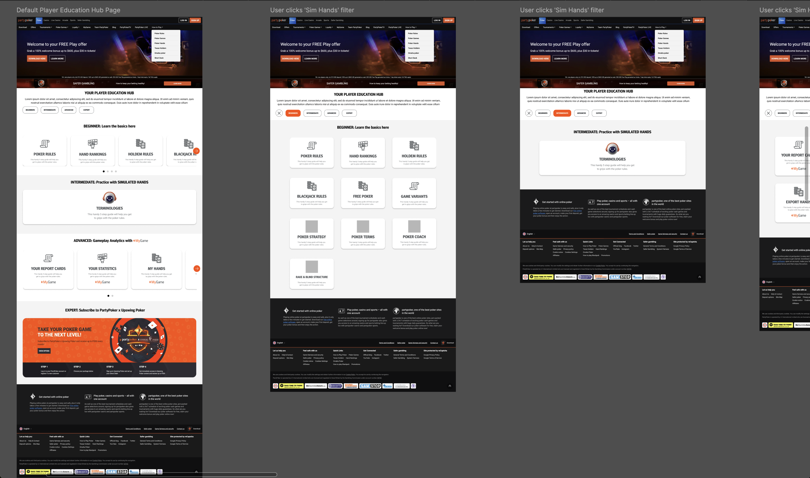
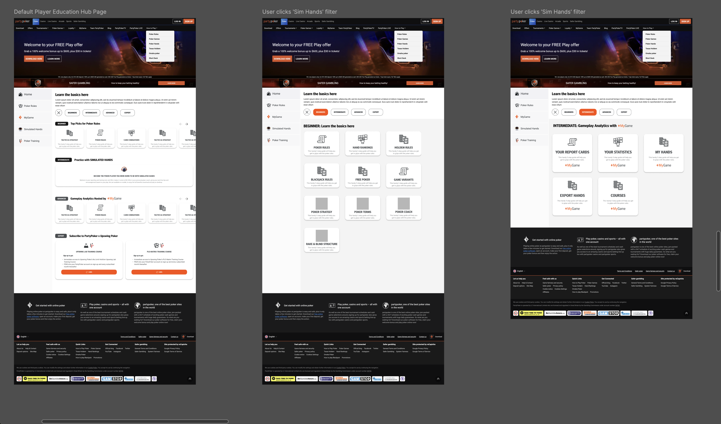
Project Overview: In my role as a UX/UI Designer for the Party Poker brand, I was tasked with presenting concepts for a 'Player Education Hub' to business and key stakeholders. This hub aimed to explain the rules of poker, special promotions, and exclusive games, enhancing user engagement with Party Poker's unique features.
Research and Planning: Recognizing the educational nature of the project, I began with extensive cross-industry research. I analyzed leading educational platforms to understand how they effectively present content to users. This research guided me in identifying best practices for categorizing and delivering information in an engaging and intuitive manner.
User Journey Mapping: With the foundational research complete, I mapped out user journeys for various use cases and scenarios. This involved detailing the steps a user would take from discovering the hub to fully understanding the poker rules and promotions. By considering different user personas and their specific needs, I ensured the hub would be accessible and valuable to a wide audience.
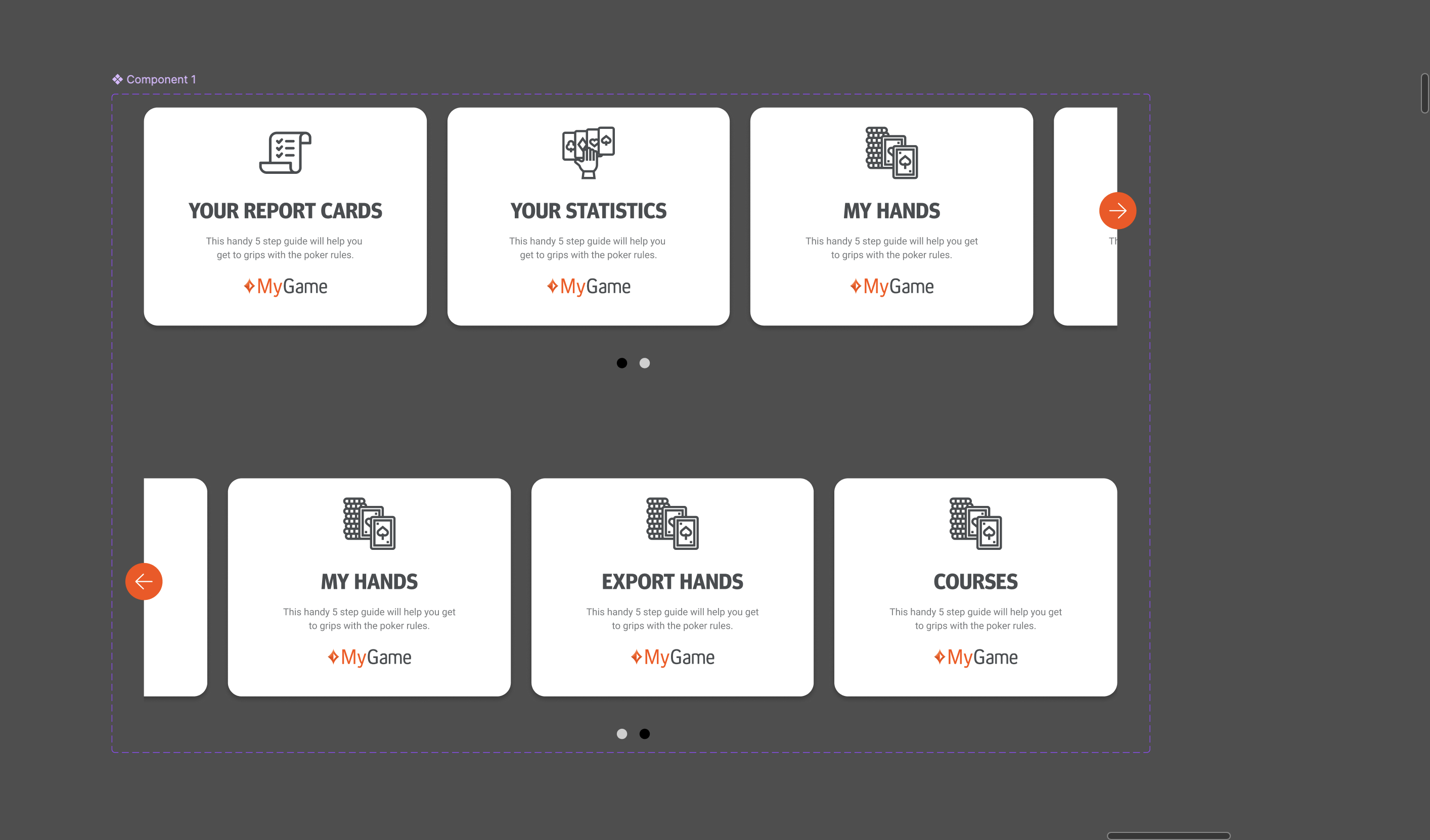
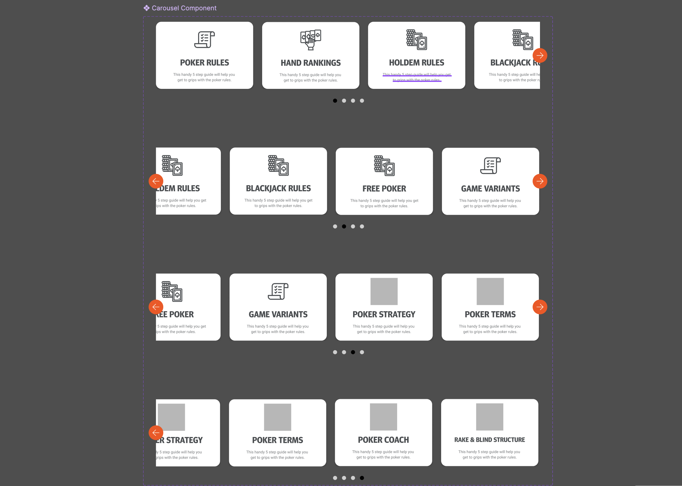
Design and Prototyping: I then created three high-fidelity prototypes, each with a unique approach to the design and information architecture. These prototypes were designed to visually and functionally demonstrate how the Player Education Hub could look and operate. They included interactive elements to show how users would navigate through the content, access tutorials, and learn about special promotions and exclusive games.
Presentation and Feedback: The prototypes were presented to business stakeholders, showcasing the potential of the Player Education Hub to increase user engagement. The presentation included detailed explanations of the design choices, user journey maps, and insights from the cross-industry research. Feedback from the stakeholders was integral to refining the final design, ensuring it aligned with both user needs and business objectives.
Outcome: The Player Education Hub successfully launched, resulting in increased user engagement with promotional and exclusive features. The hub provided a comprehensive and user-friendly platform for players to learn and engage more deeply with the Party Poker brand, ultimately driving higher satisfaction and retention rates.
Selected Works

Wimble.AI [SAAS Product, A.I]Web Application
MyHomeTV App [Freelance]App Design

Entain [Core UX/UI Design][Core UX/UI Design]
PartyPoker Tutorial [Player Education]Web Application

Crypto Payments [Entain]Corporate Design
Ladbrokes Registration [Entain]Corporate Design / Findings Presentation

Startup Sherpa Website [Freelance]Corporate Design
Mintage Payroll [SAAS Product, HR]Web Application
Linger website [Freelance]Corporate Design
Dudley House WebsiteCorporate Design
LU2ON WebsiteCorporate Design
British Pearl [Concept Design]App Design
Amazon Alexa - Australia TeamAudio-linguistic UX Design
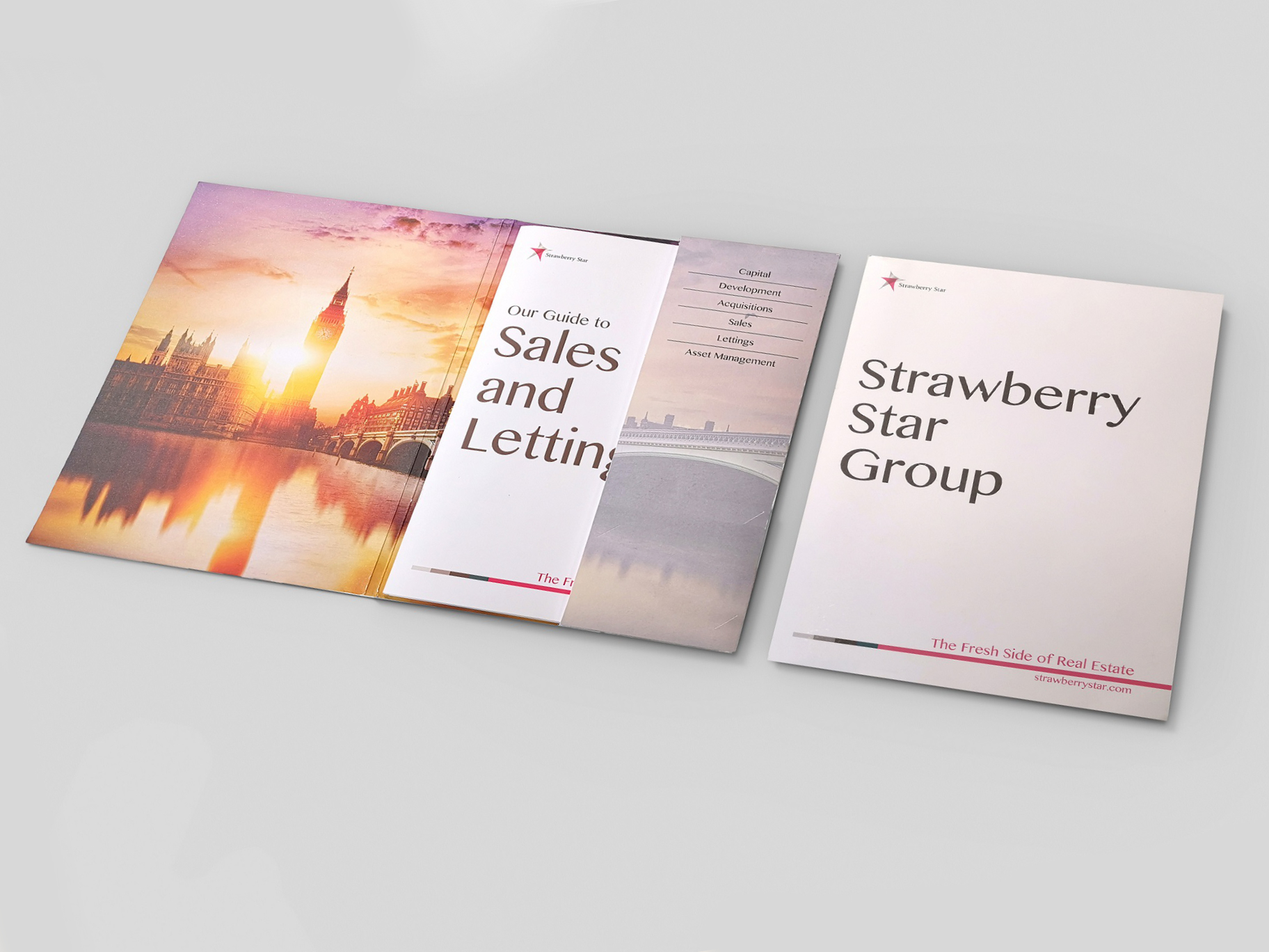
Print ProductionCorporate Design
