Overview
I collaborated with a UX team on the redesign of a bespoke travel company Linger which was catering to high to ultra-high net worth individuals looking to take time from their work and go on a sebatical but don’t want an off-the-shelf travel experience. Our brief was to improve the user experience, journey flow, conversion and retention rate.
This was a UX and UI centred job would be focussed on developing for mobile as the owner of the company expressed interest in seeing what the site could look like if optimised for mobile phones.
The Challenge
As the website was not intended to function as travel websites usually do (with the ability to book a holiday right from the website itself), the main challenge was establishing trust and introducing a call to action for the user at the right point in their journey. I also wanted to give the user the ability to construct a low resolution holiday with itinerary that would then inspire the user to click a call to action and speak with an advisor. The function of the website was not to sell but to start the user journey with a salesperson.
The Process
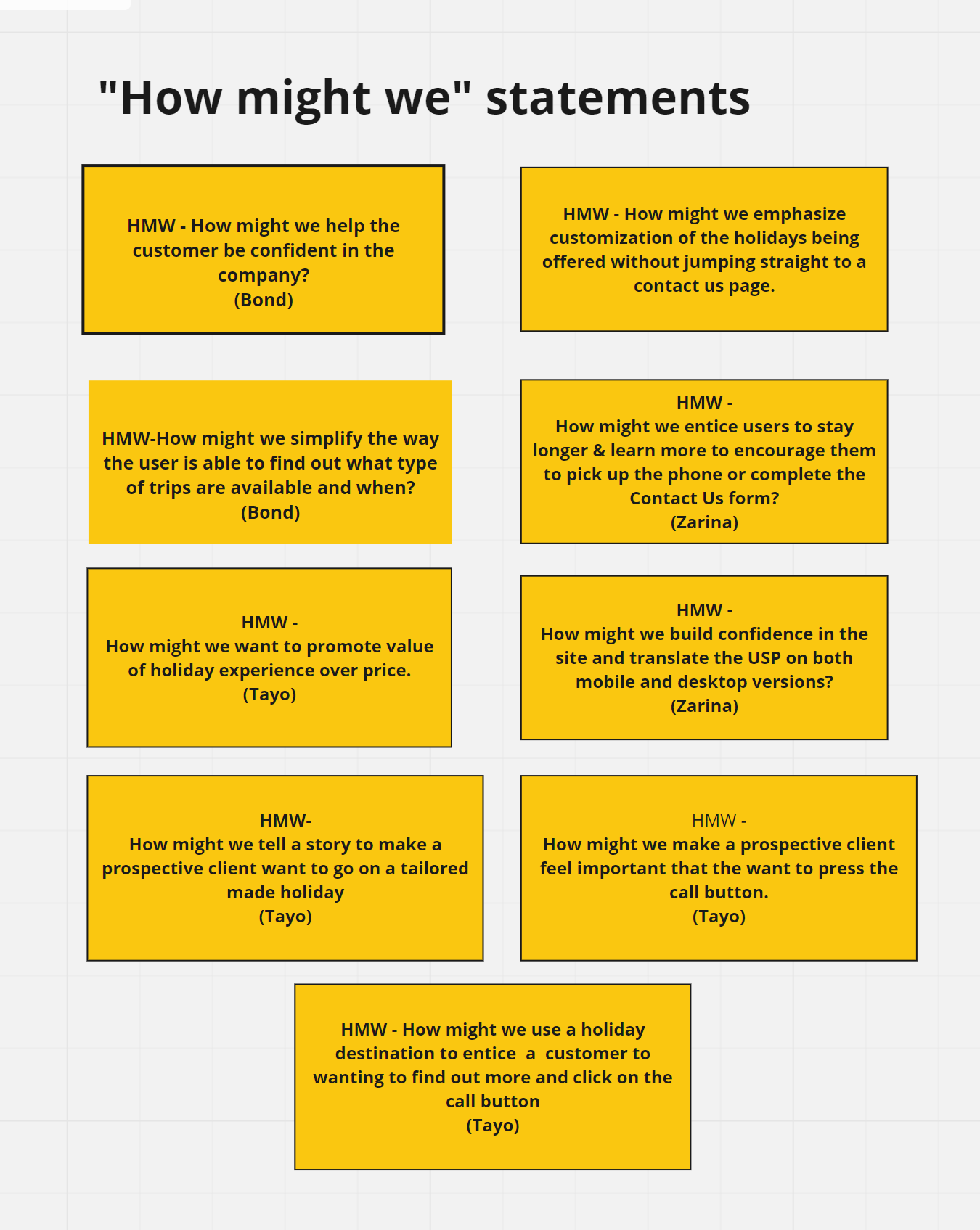
As this was a brief intended to improve a currently existing site, i wanted to start by conducting a UX Audit using Heuristic Analysis and use the notes from that as a starting point for concieving a set of goals that would improve the functionality. I also felt it would be necesary to conduct a customer journey map to help me understand the complete user journey and where the website fits in the process, some user testing to better understand any shortcomings and painpoints in the customer journey followed by User Flows, Low-Fi and then Hi-Fi Prototype and then a presentation to the Stakeholder.
Problem & Hypotheses
THE PROBLEM:
After conducting a UX audit, we noted:
- Lack of retention
- Low contact numbers
- Lack of depth of detail on website
- Confused by calls to action
- Confused by purpose of the website
- Feel pressurised to contact the Linger team too soon
THE SOLUTION:
We believe that by improving the current site’s journey flow, delving deeper into the destinations and expertise offered by this bespoke luxury travel company, we can build confidence in the brand, keep visitors engaged for longer and entice them to contact the company directly.
User Testing Phase
USER INTERVIEWS
We conducted multiple user interviews Via Zoom, following an interview script. Each candidate was carefully screened with those not falling within the clients targeted user profile being removed from the approved group.
each interview was conducted in line with our script with interviewees being encouraged to openly share their thoughts in real time.
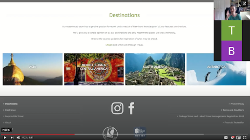
“Well I can’t book a trip to Borneo because as soon as you click into Borneo it simply says ‘Contact Us’.’’
“Well I can’t book a trip to Borneo because as soon as you click into Borneo it simply says ‘Contact Us’.’’
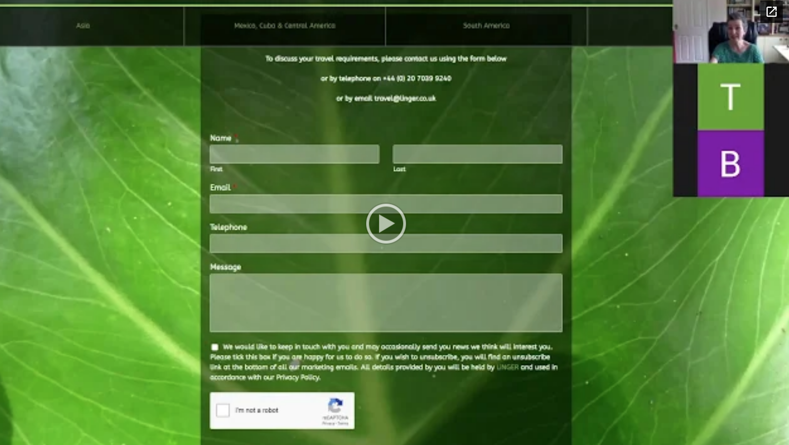
“If you fill out a form, they’re going to call you at a time when you might be in the middle of working or doing something.”
“If you fill out a form, they’re going to call you at a time when you might be in the middle of working or doing something.”
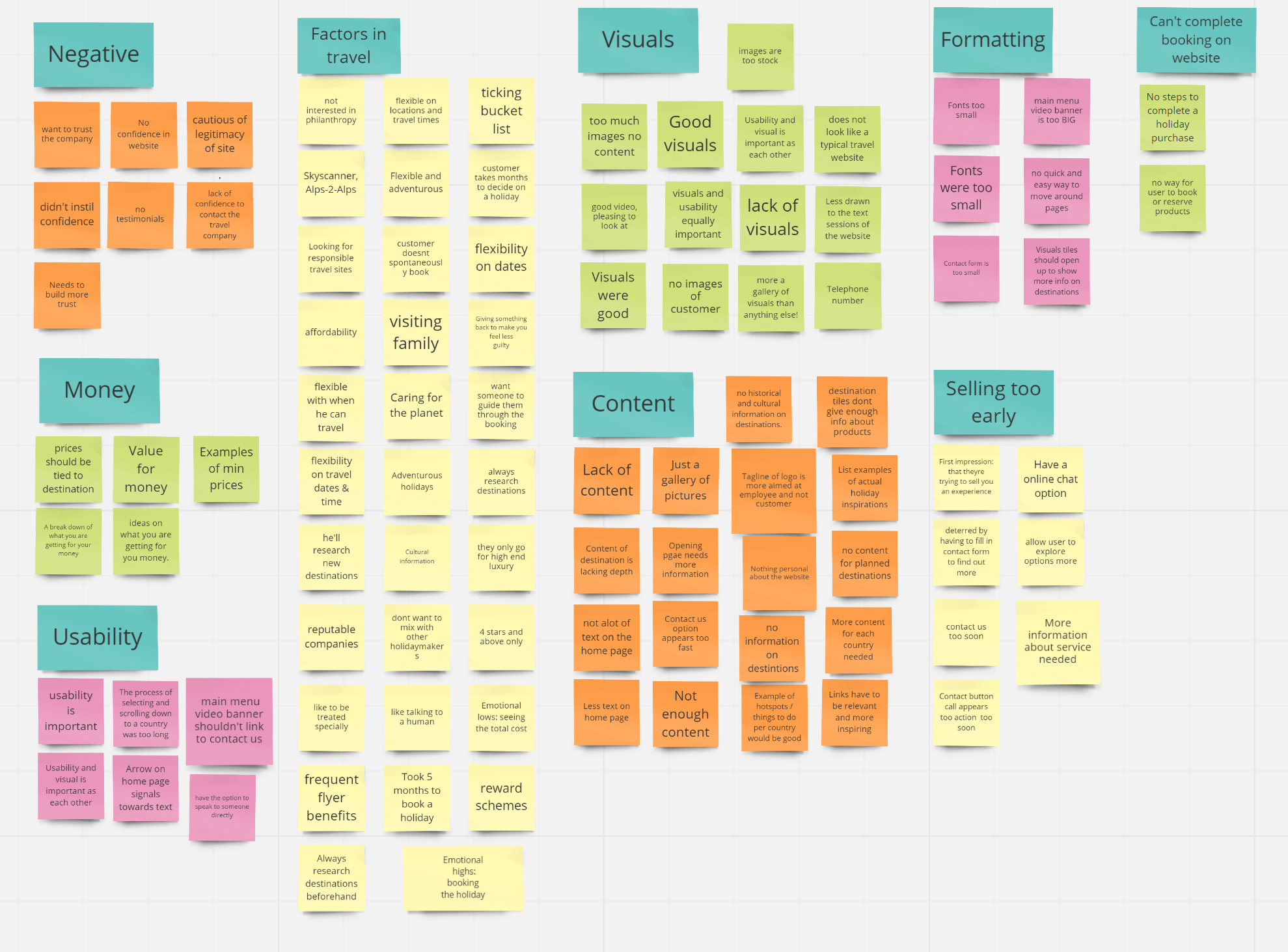
User Findings
- Conducted user research/testing with 9 users who fit the profile.
- Users were given an array of tasks.
- Users were encouraged to verbalise their experiences throughout the process.
- Insights were categorized into the following:
- Usability
- Negatives
- Visuals/Aesthetics
- Content
- Formatting
- Deciding Factors of Travel
- Booking Process
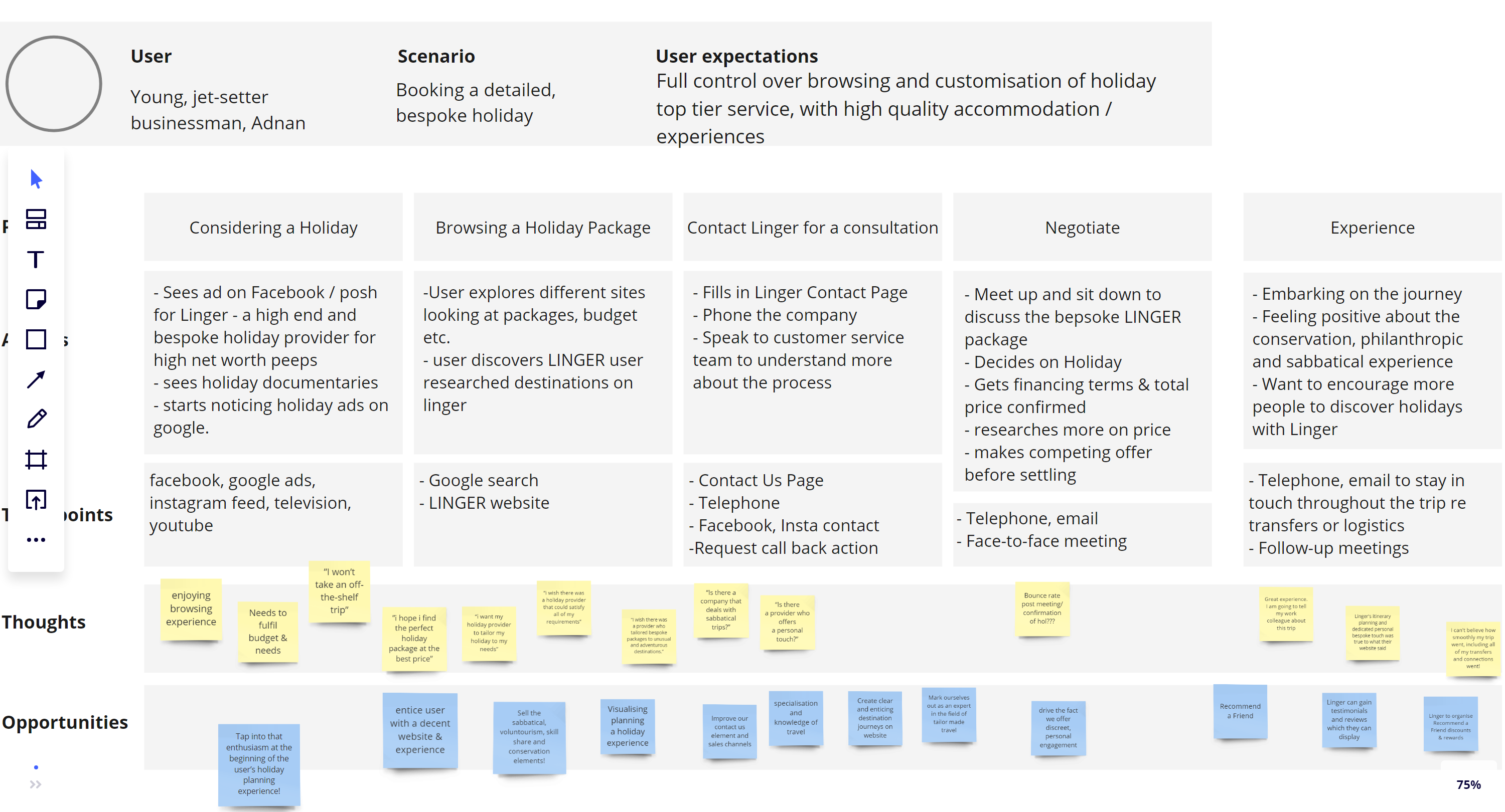
Customer Journey Mapping
As the website was intended as a vehicle to facilitate contact with a sales team, i decided that Customer Journey Mapping would be essential as I wanted to better understand the relationship between the customer and the organization over time and across all channels on which they interact with the businessnas intended. With this form of analysis i could:
● Chart the user’s thought process as they complete the intended task
● Highlight pain points & opportunities for improvement in the user experience
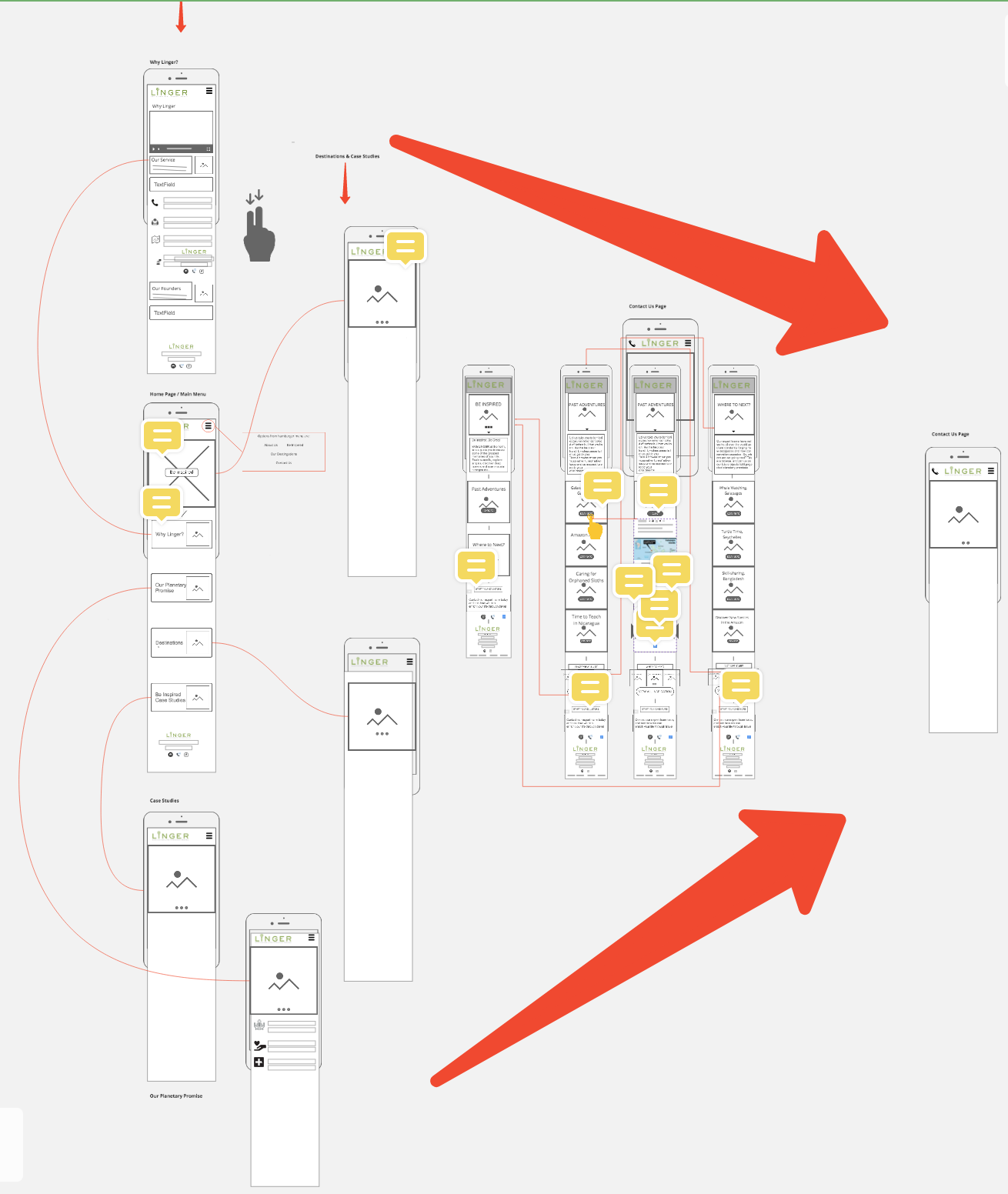
User Flow
Re-mapping the content and information architecture of the current site took thought and results of the user testing to create.
We wanted to :
● Create new steps and remove dead ends.
● Simplify the user journey.
● Funnel the entry into the Contact Us page.
● Let the user construct a holiday package.
● Reduce calls to action on the Home Page.
● Allow user to add items to their holiday package.
● Finish the journey with a simple unimposing form.
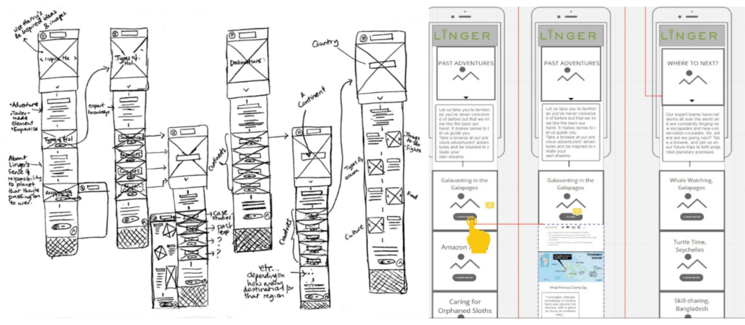
Lo-Fi to Hi-Fi Wireframing
To begin the design process, wireframing and low fidelity prototypes were required. The idea, even at this stage, was to delve deeper into each journey flow and provide expert knowledge on the destinations Linger offer
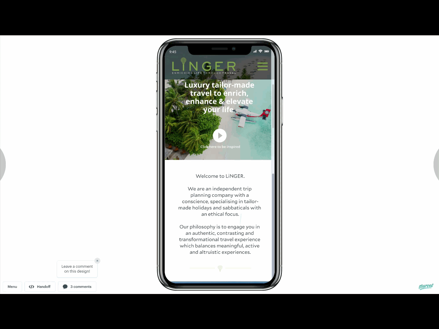
Hi-Fi Prototyping (Marvell)
Following on from the Wireframing phase, i wanted to present to the client a working prototype showing a complete journey where the user selects destinations and itninerary items to form a low resolution idea of what their holiday could be like if booked through LINGER. I wanted to show the journey right up until the point where a call to action is displayed and argue the reasons for this approach.
TEAM: UX ACADEMY
PROJECT: Linger Travel Company UX/UI Design
ROLE: UX Lead
TIMELINE: 3 Months
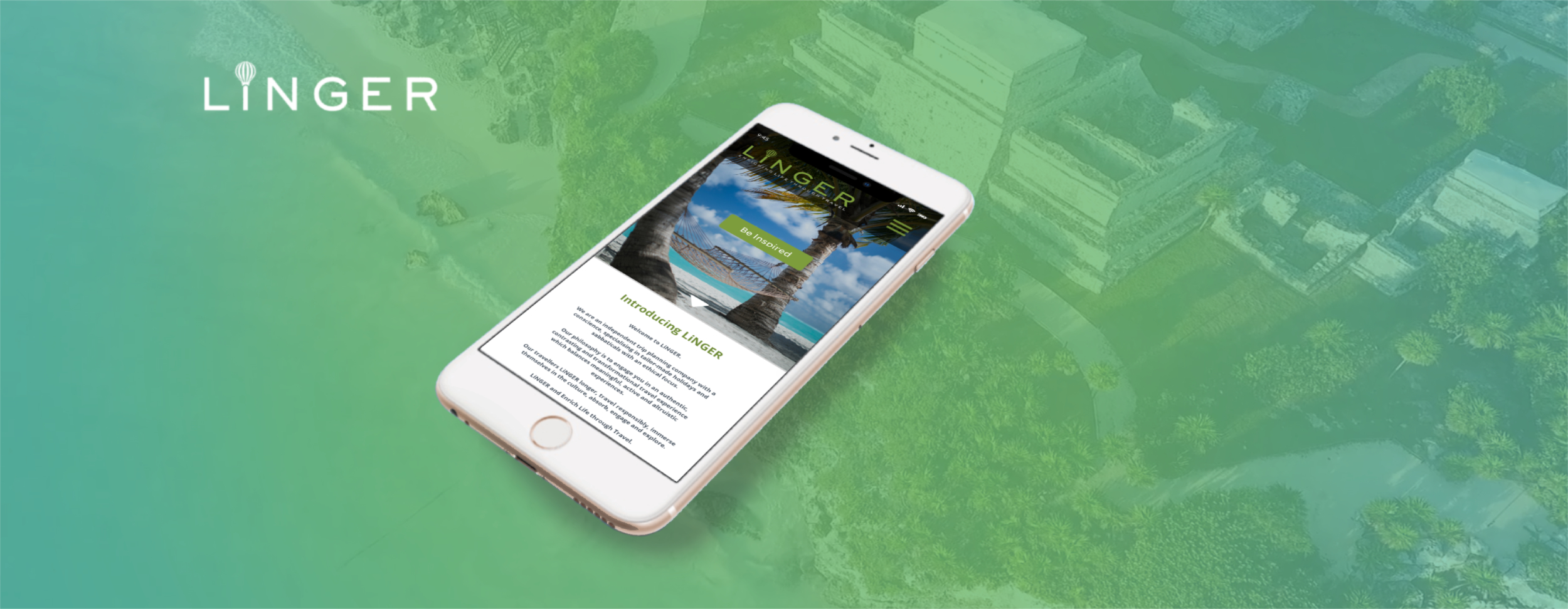
WEBSITE: linger.co.uk

Selected Works

Wimble.AI [SAAS Product, A.I]Web Application

MyHomeTV App [Freelance]App Design

Entain [Core UX/UI Design][Core UX/UI Design]

PartyPoker Tutorial [Player Education]Web Application

Crypto Payments [Entain]Corporate Design
Ladbrokes Registration [Entain]Corporate Design / Findings Presentation

Startup Sherpa Website [Freelance]Corporate Design
Mintage Payroll [SAAS Product, HR]Web Application

Linger website [Freelance]Corporate Design
Dudley House WebsiteCorporate Design
LU2ON WebsiteCorporate Design
British Pearl [Concept Design]App Design

Amazon Alexa - Australia TeamAudio-linguistic UX Design
Print ProductionCorporate Design