
Overview
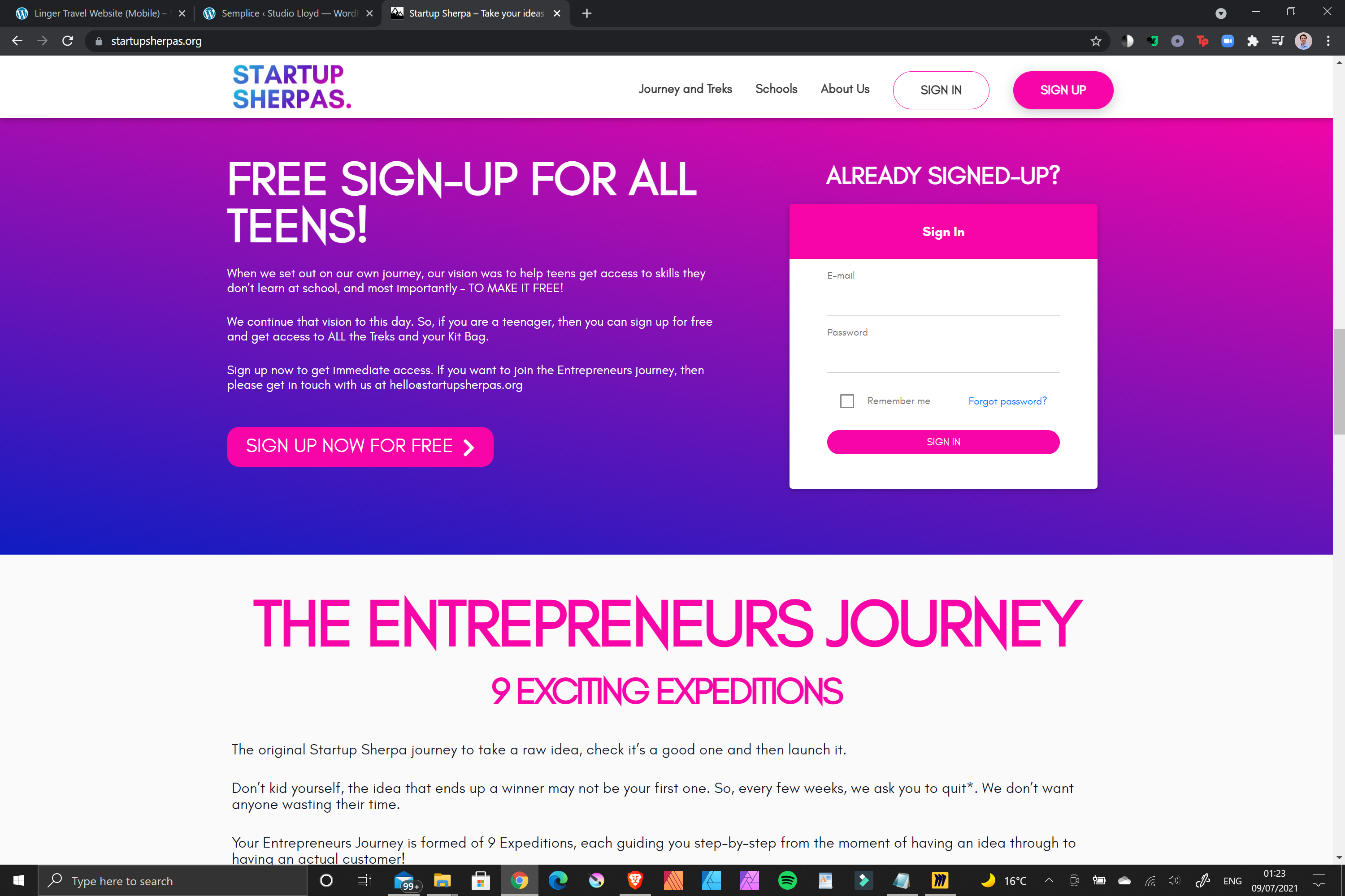
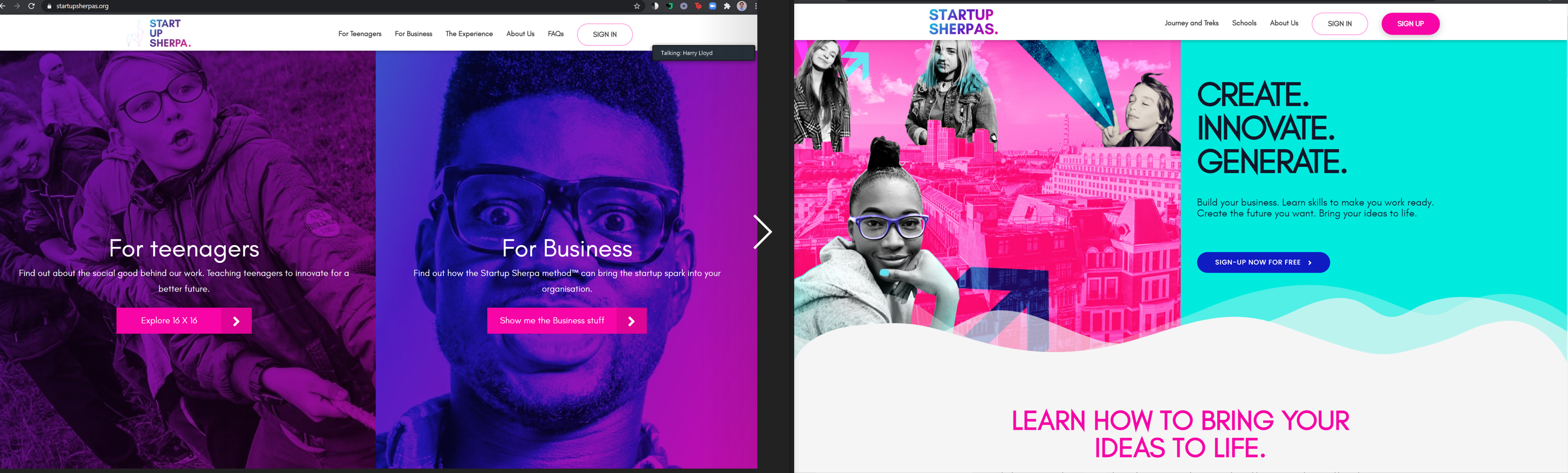
Approached by the founders of Start Up Sherpa I was initially asked to improve the website with a focus on improving the value proposition and onboarding process. The business was conceived as a online education portal for supporting budding entreprenuers in the launch of their business ideas.
The Challenge
Initially aimed at a range of customers from businesses looking to train their staff to young professionals working alone, and even school children and educational institutions; this created a huge challenge from a UX/UI perspective in grappling with the needs of a range of users.
The Process
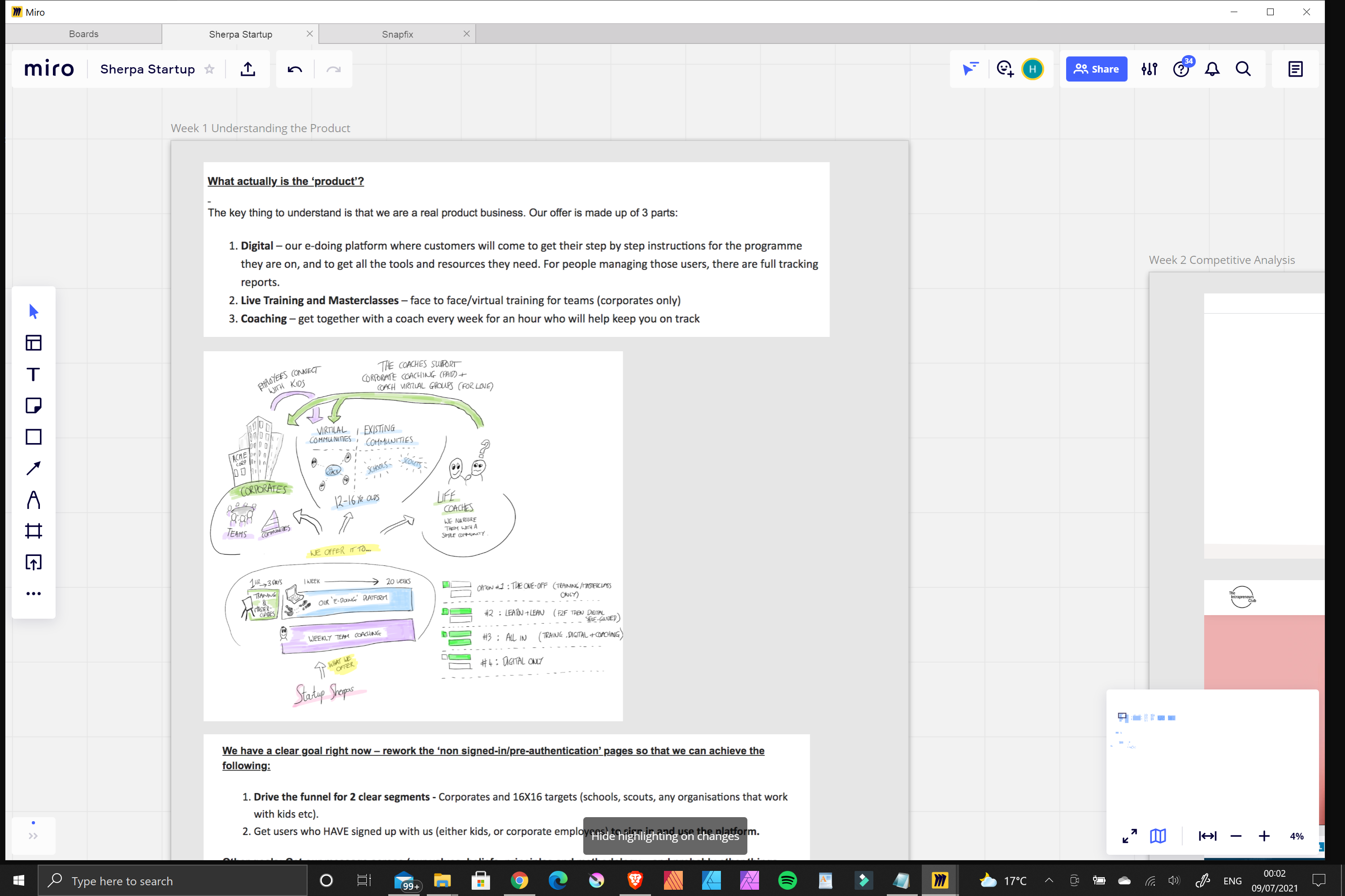
This was a a more UI focussed job with an emphasis on developing the asthetics of the website with the aim of improving the user retention and onboarding process as well as reducing the bounce rate. I did however want to take a the opportunity to conduct a heuristic analysis and some user testing to better understand any shortcomings and painpoints in the customer journey.
Problem & Hypotheses
THE PROBLEM:
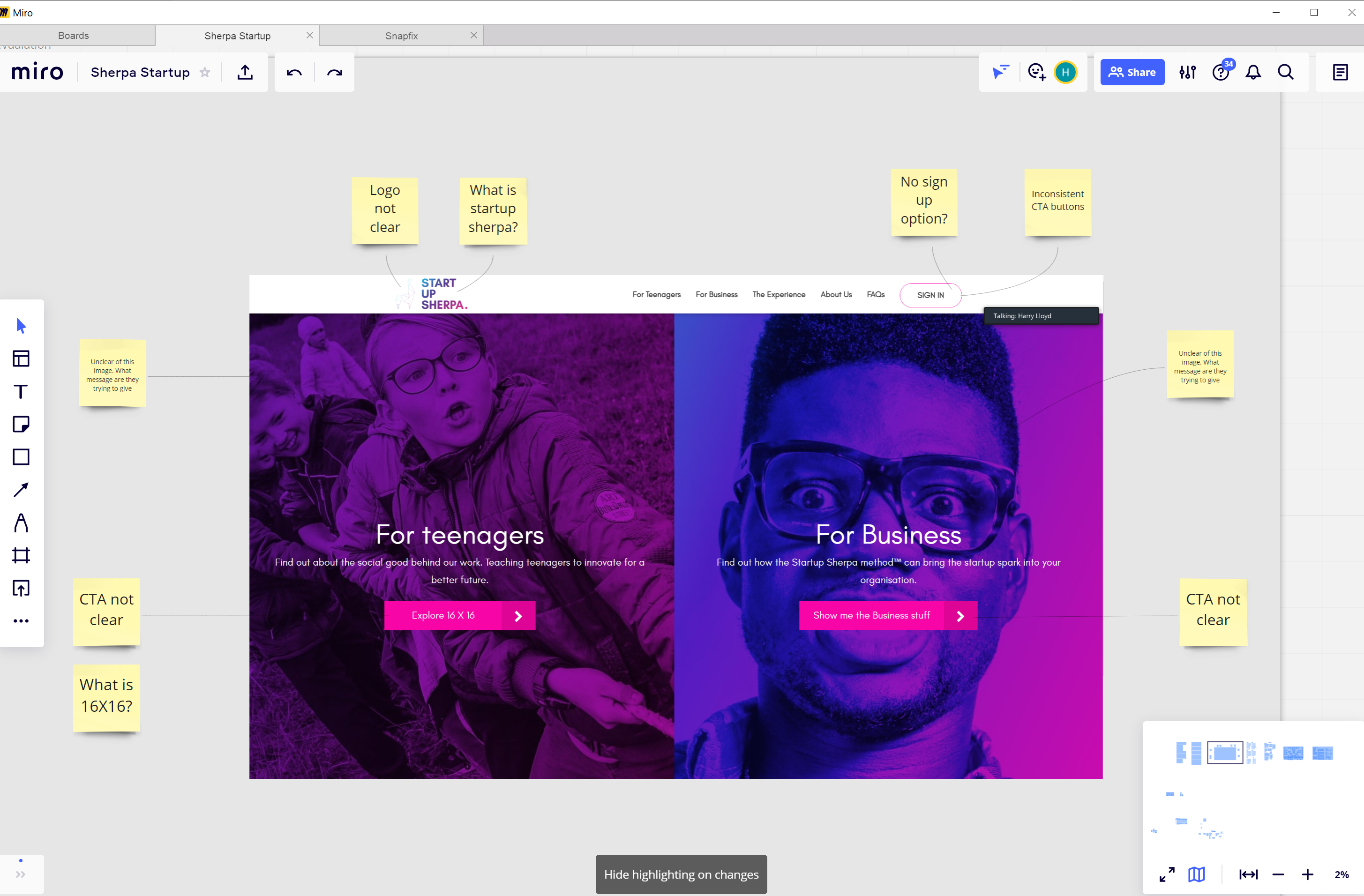
After conducting a UX audit, I noted the following issues:
- Lack of clarity on what the product is
- mixed messaging on the home page and lack of a unified singular purpose statement
- Lacking depth
- Confused by conflicting calls to action
- Confused by overall purpose of the website
- Split website causes confusion
- Feel pressurised to contact the Sherpa team too soon
THE SOLUTION:
It was important to the founders that the messaging and value proposition of the website be conveyed more succinctly and that there was no confusion over the onboarding process requiring a consultation and tailoring of the product package depending on the customers circumstances. It was also apparent that the information architecture and user journey from home page to sign up needed some consideration.
Problem & Hypotheses
THE PROBLEM:
After conducting a UX audit, we noted:
- Lack of retention
- Low contact numbers
- Lack of depth of detail on website
- Confused by calls to action
- Confused by purpose of the website
- Feel pressurised to contact the Linger team too soon
THE SOLUTION:
We believe that by improving the current site’s journey flow, delving deeper into the destinations and expertise offered by this bespoke luxury travel company, we can build confidence in the brand, keep visitors engaged for longer and entice them to contact the company directly.

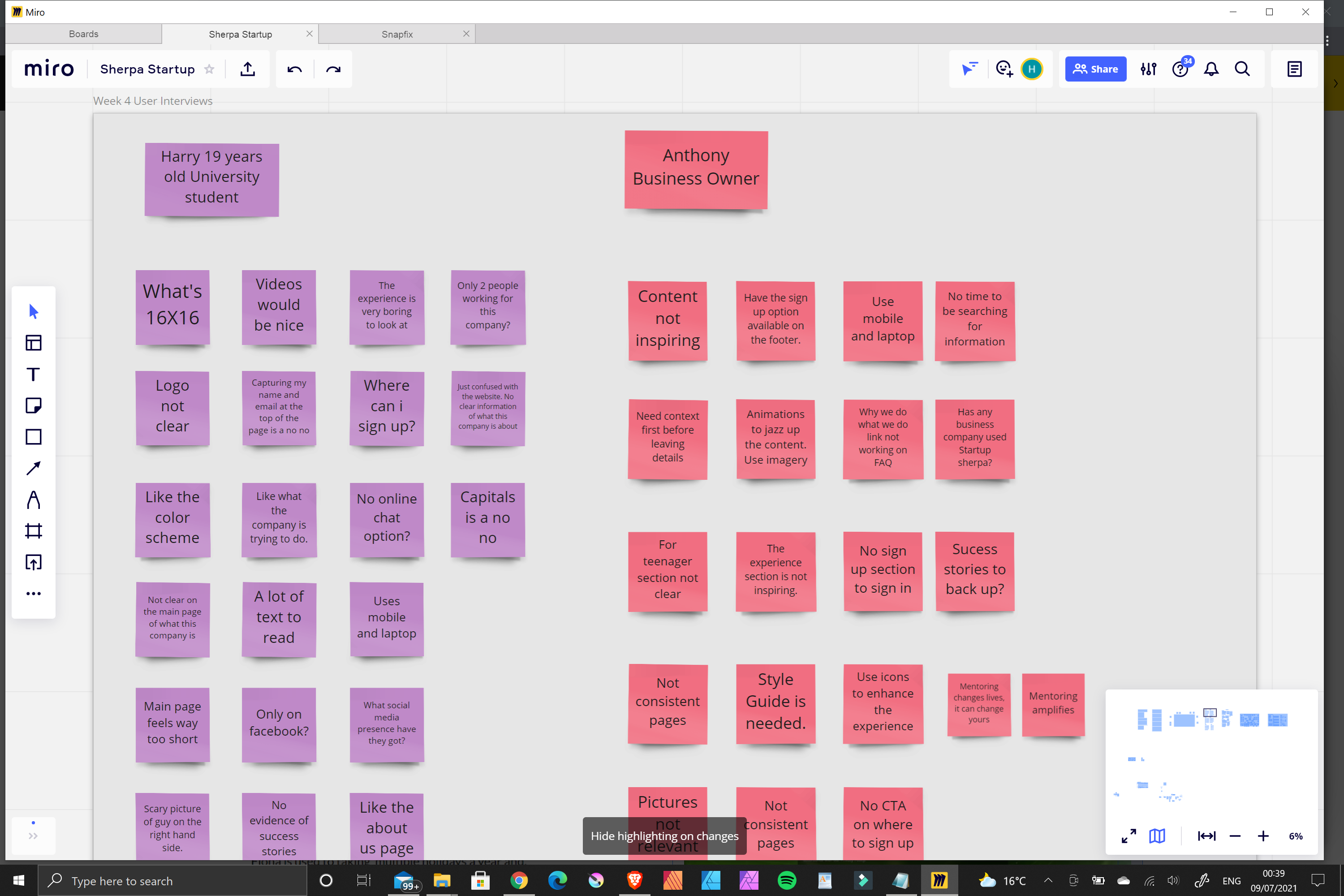
Heuristic Analysis with sticky notes on Miro. Click Here to view the board
User Testing Phase
USER INTERVIEWS
We conducted multiple user interviews Via Zoom, following an interview script. Each candidate was carefully screened with those not falling within the clients targeted user profile being removed from the approved group.
each interview was conducted in line with our script with interviewees being encouraged to openly share their thoughts in real time.
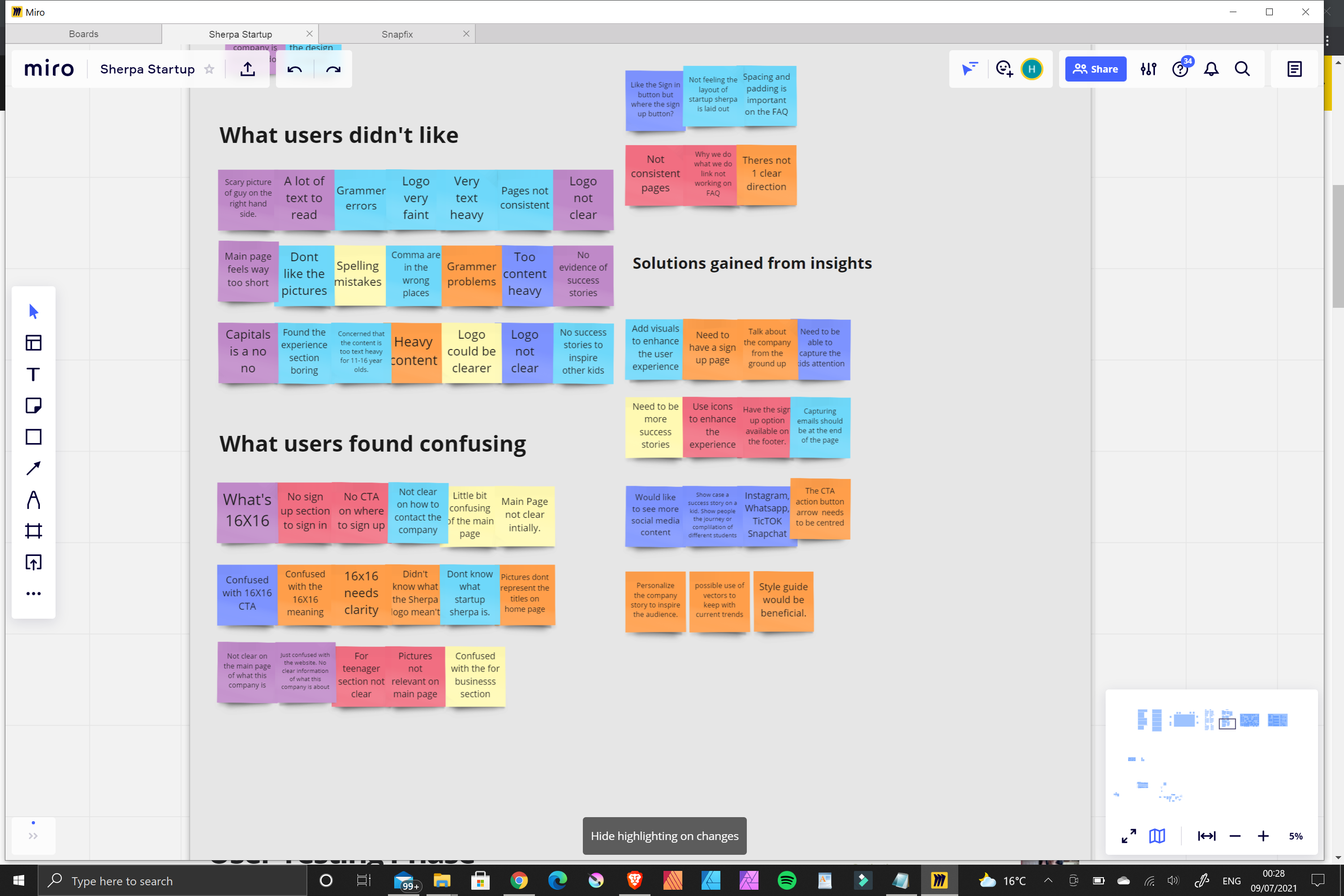
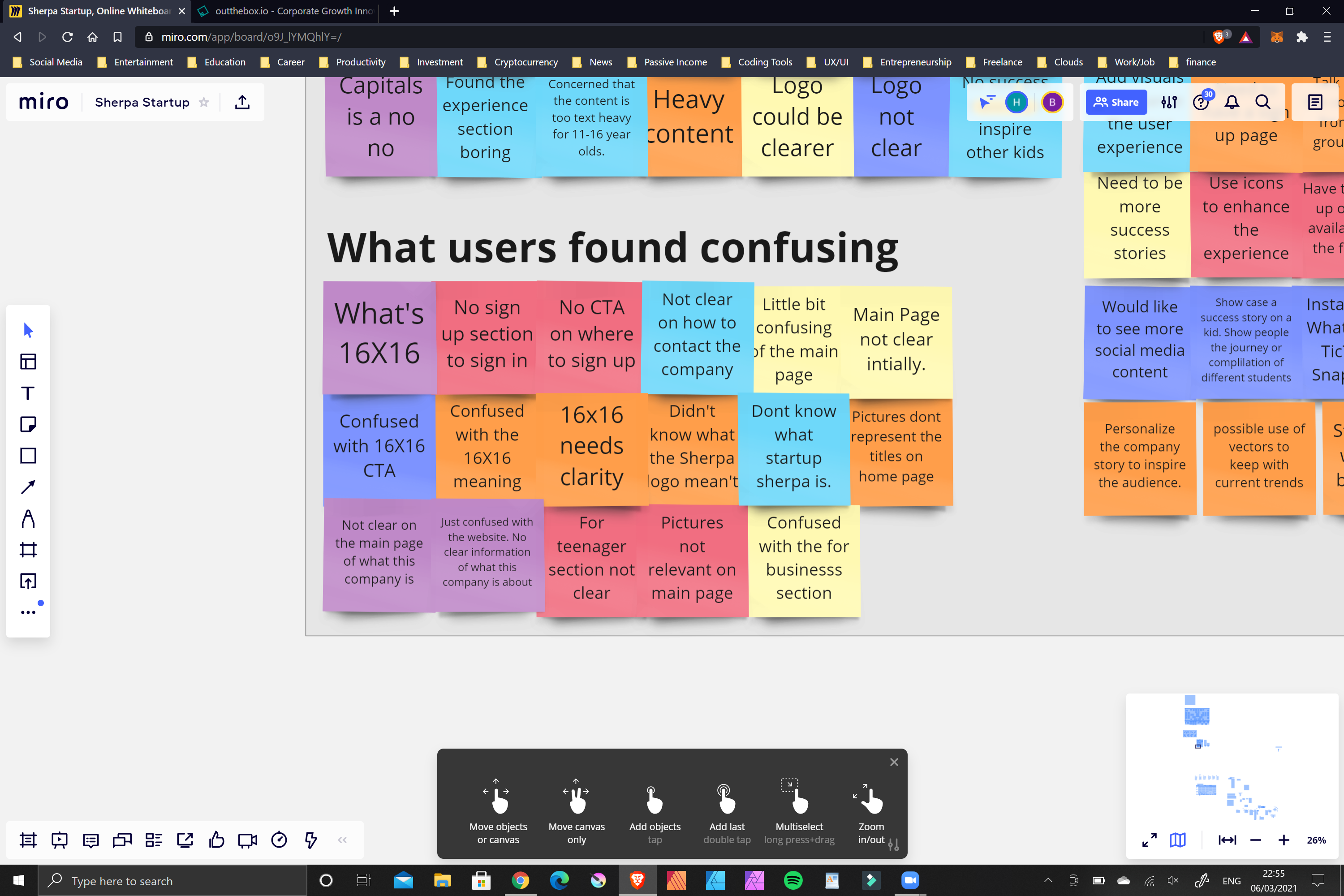
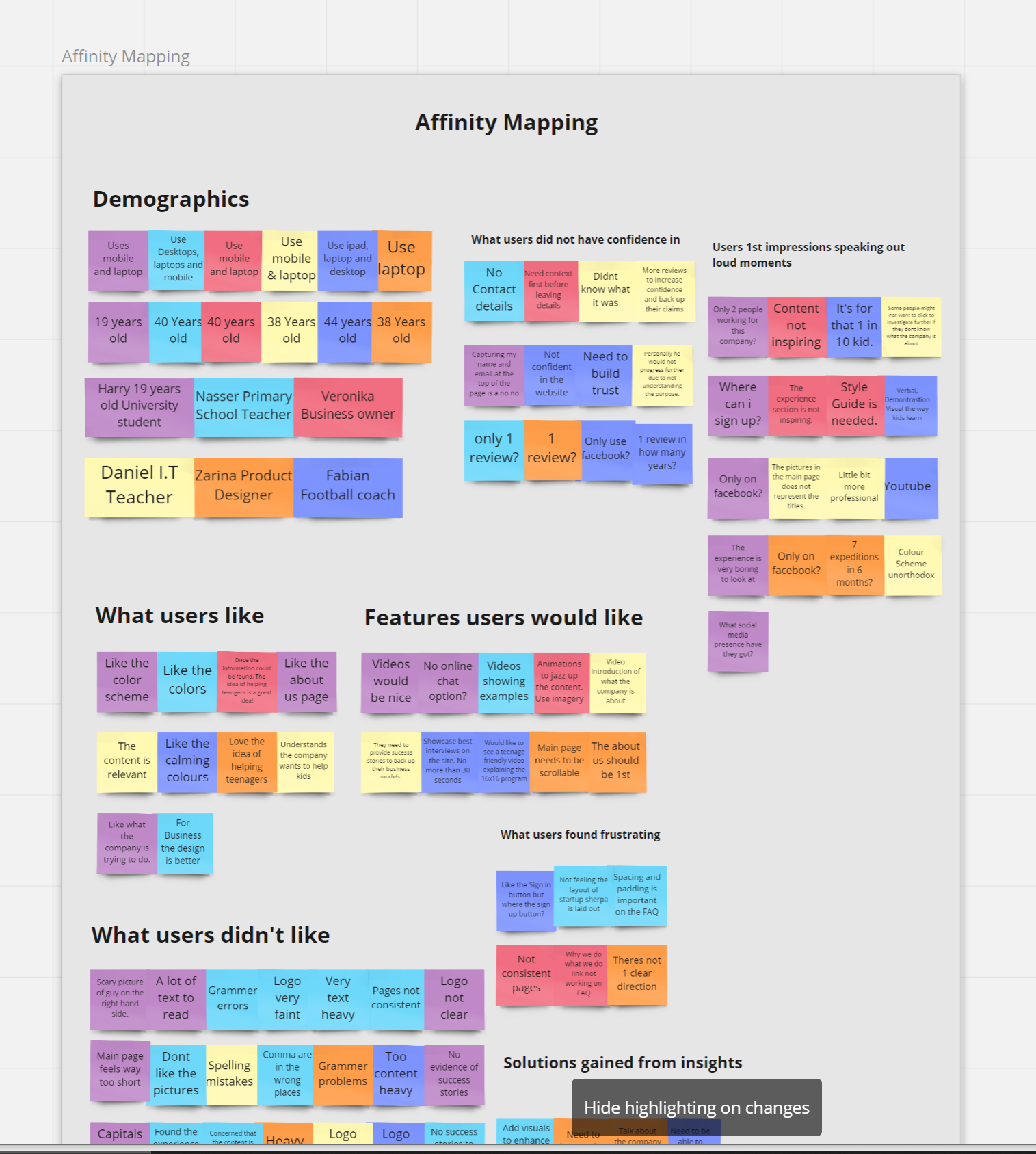
User Findings
- Conducted user research/testing with 9 users who fit the profile.
- Users were given an array of tasks.
- Users were encouraged to verbalise their experiences throughout the process.
- Insights were categorized into the following:
- Usability
- Negatives
- Visuals/Aesthetics
- Content
- Formatting
- Deciding Factors of Travel
- Booking Process
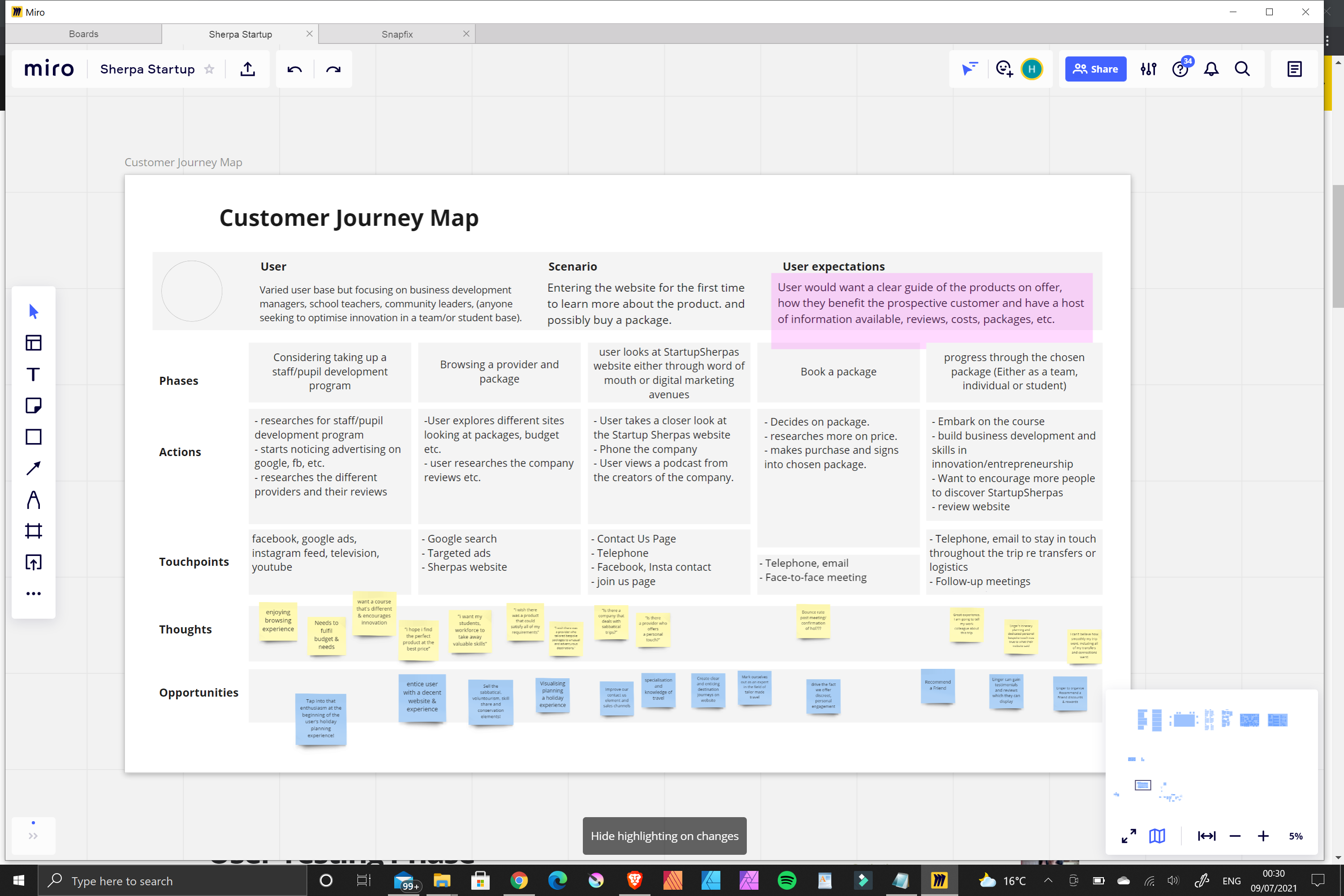
Customer Journey Map
Undertaken to chart the course of the user journey as intended:
● Chart the user’s thought process as they complete the intended task
● Highlight pain points & opportunities for improvement in the user experience
Information Architecture
Re-mapping the content and information architecture of the current site took thought and results of the user testing to create.
We wanted to :
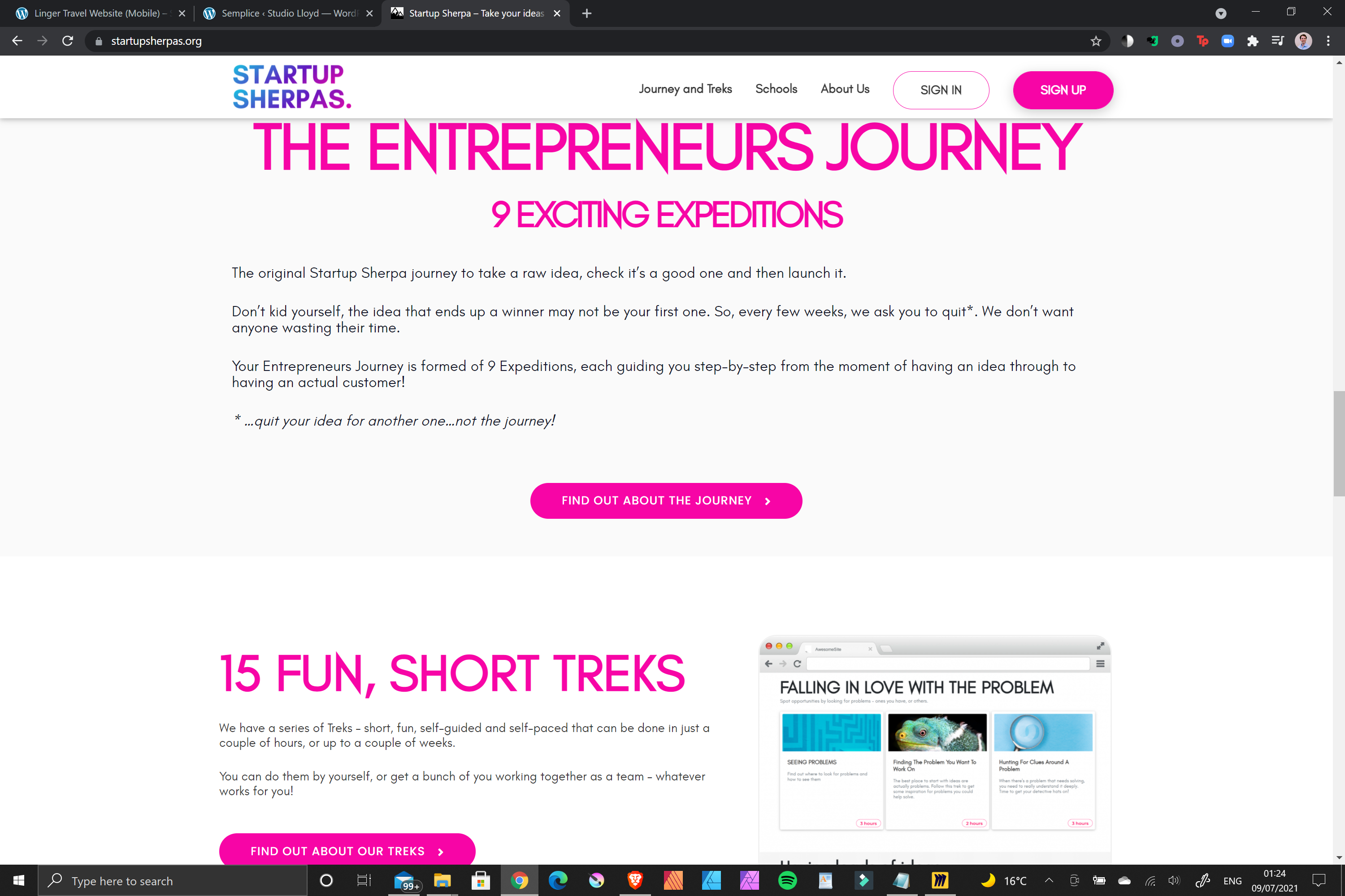
● Explain the product on the home page succinctly and explain the entreprenuers journey
● Introduce the Digital Learning Platform
● Introduce free sign up offer for teens
● Unify the Business and Schools user journey up until onboarding begins
● Simplify the user journey
● Funnel the user into the Sign Up page
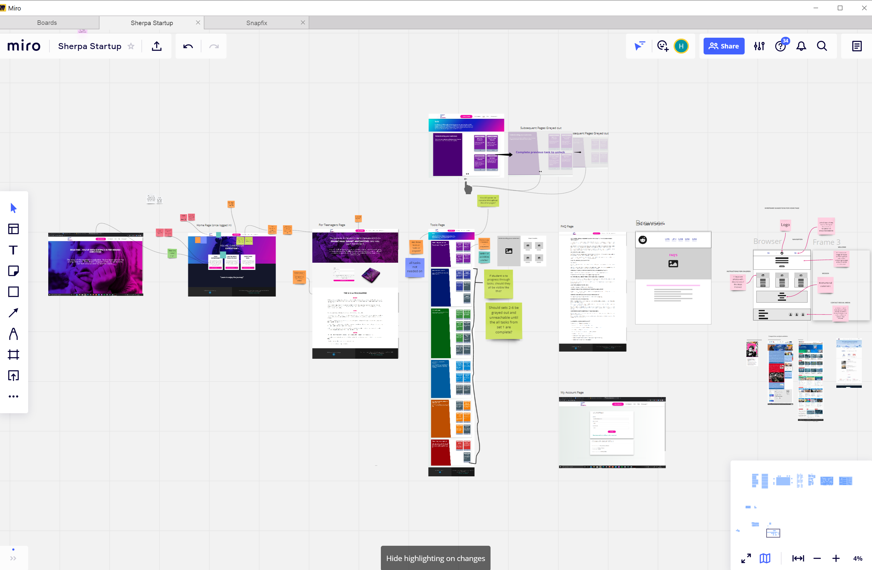
Wireframing
To begin the design process, wireframing and low fidelity prototypes were required. The idea, even at this stage, was to delve deeper into each journey flow and provide expert knowledge on the destinations Linger offer
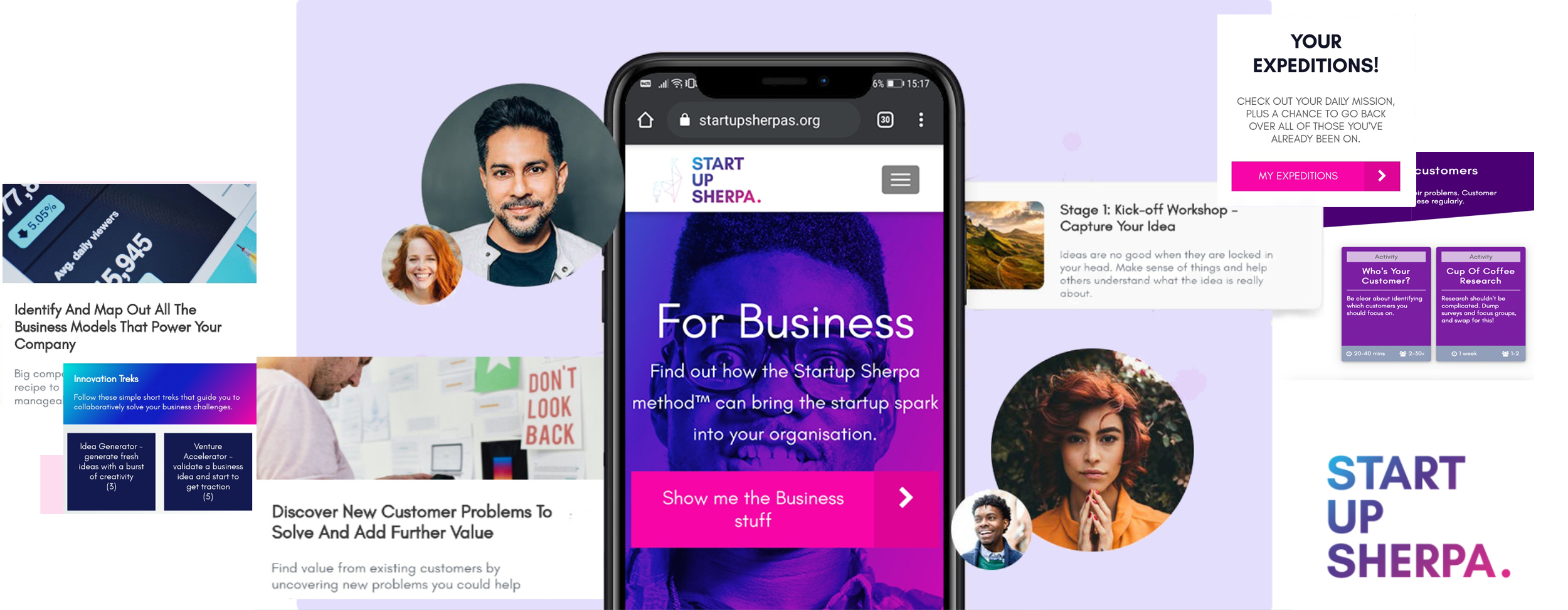
TEAM: Freelance
PROJECT: Start Up Sherpa UX/UI Design
ROLE: UX/UI Designer
TIMELINE: 5 Months
WEBSITE: startupsherpas.org
Selected Works

Wimble.AI [SAAS Product, A.I]Web Application

MyHomeTV App [Freelance]App Design

Entain [Core UX/UI Design][Core UX/UI Design]

PartyPoker Tutorial [Player Education]Web Application

Crypto Payments [Entain]Corporate Design

Ladbrokes Registration [Entain]Corporate Design / Findings Presentation

Startup Sherpa Website [Freelance]Corporate Design
Mintage Payroll [SAAS Product, HR]Web Application

Linger website [Freelance]Corporate Design

Dudley House WebsiteCorporate Design

LU2ON WebsiteCorporate Design
British Pearl [Concept Design]App Design

Amazon Alexa - Australia TeamAudio-linguistic UX Design
Print ProductionCorporate Design